Details
-
Type:
Improvement
-
Status: Closed (View Workflow)
-
Priority:
 Major
Major
-
Resolution: Done
-
Affects Version/s: None
-
Fix Version/s: None
-
Labels:None
-
Story Points:0.5
-
Epic Link:
-
Sprint:Fall 7 Dec 14 - Dec 23, Winter 1 Dec 28 - Jan 8
Description
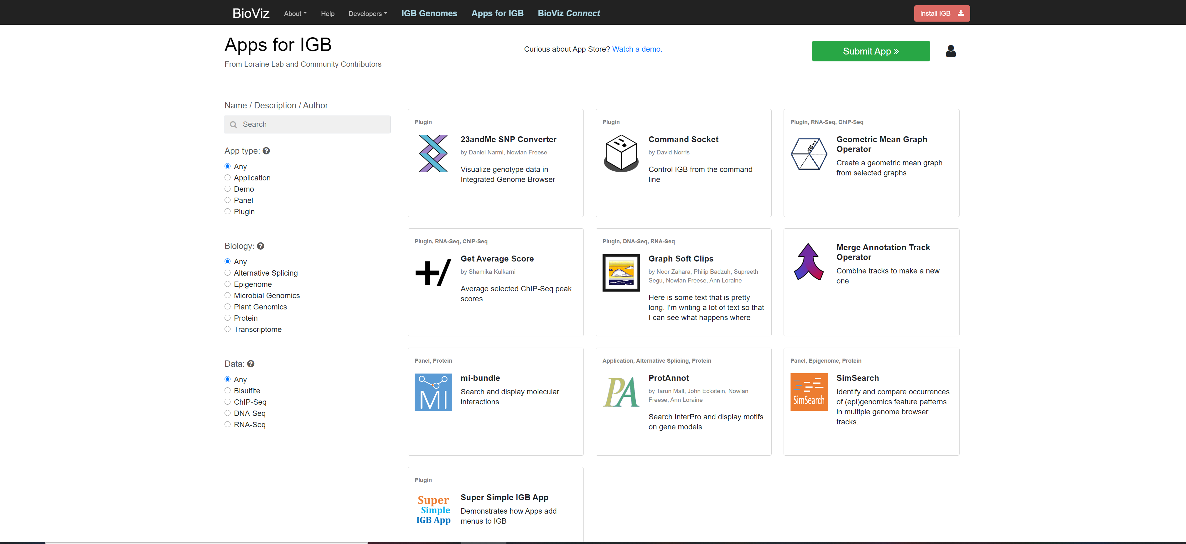
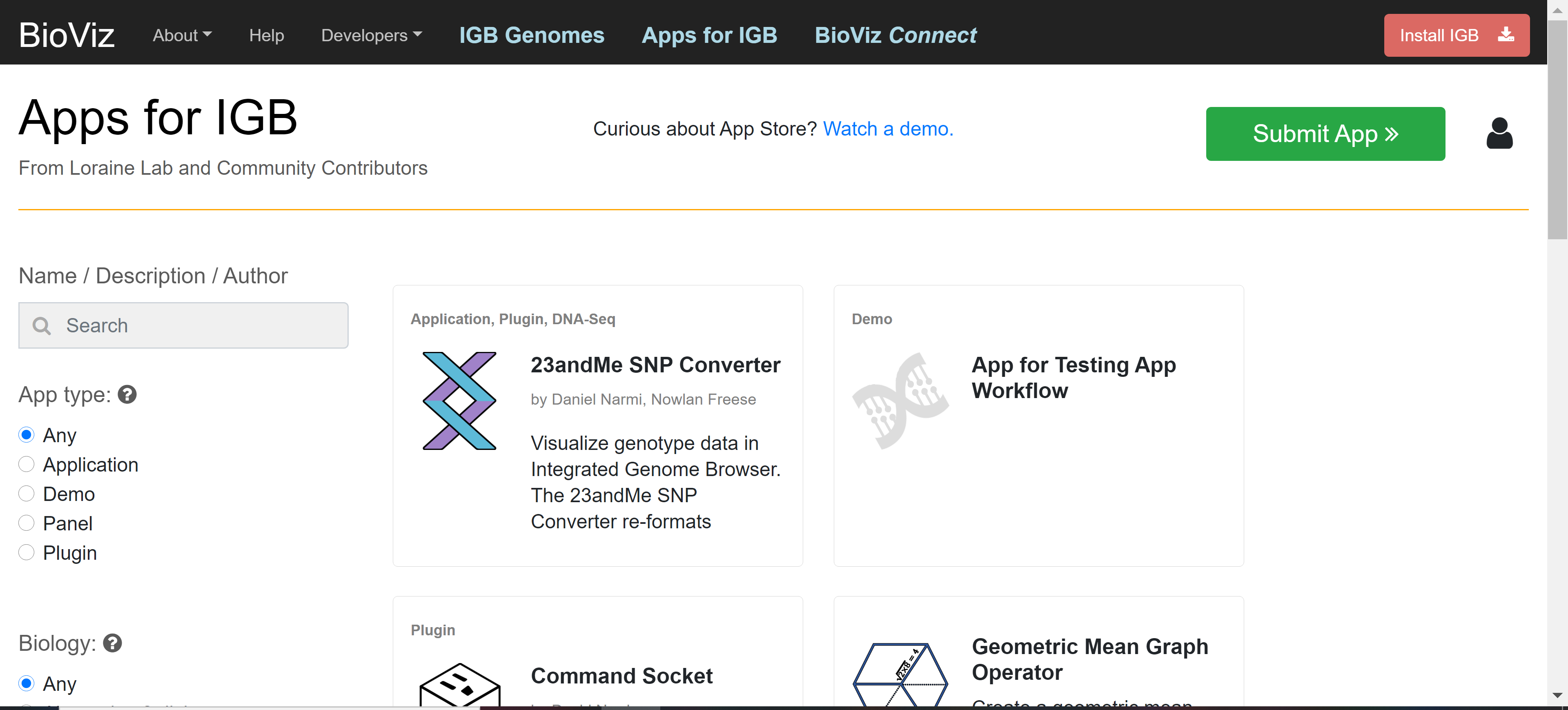
Depending on the width of the page, the right sides of graphical elements do not line up, which looks a bit weird. It would be better if they were lined up so that their right side boundaries are in alignment.
Please see attached image.
Attachments


Activity
The top elements (upper menu bar, orange line) are in alignment, which improves the appearance. Sameer Shanbhag is working on making some changes which will likely address problems with getting the app tiles to appear together in a row of three tiles at 100%. I think it would be OK to move this to "Done" unless there are some easy fast corrections that can be made.
Tested the application at different zoom levels on devappstore3 using chrome. Since we are using bootstrap output might differ on screen size.
1) 100%: Was able to see only two app tiles in one row but the install IGB button and orange horizontal line are aligned.

2) 80%: Three app tiles are aligned in one row but install IGB button goes out of the screen.

3) 50%: Three app tiles are aligned in one row, but the right alignment is off.

Sai Supreeth Segu: Please check the alignment on your machine also.
Merged and deployed to https://devappstore3.bioviz.org.
Is this ready for testing now, or are you planning to submit a new PR with this issue?
Pull Request Submitted:
This looks same on Mac OS as well. Moving this ticket to done.