Details
-
Type:
Task
-
Status: Closed (View Workflow)
-
Priority:
 Major
Major
-
Resolution: Done
-
Affects Version/s: None
-
Fix Version/s: None
-
Labels:None
-
Story Points:1
-
Epic Link:
-
Sprint:Winter 1 Dec 28 - Jan 8, Winter 2 Jan 11 - Jan 22, Winter 3 Jan 25 - Feb 5
Description
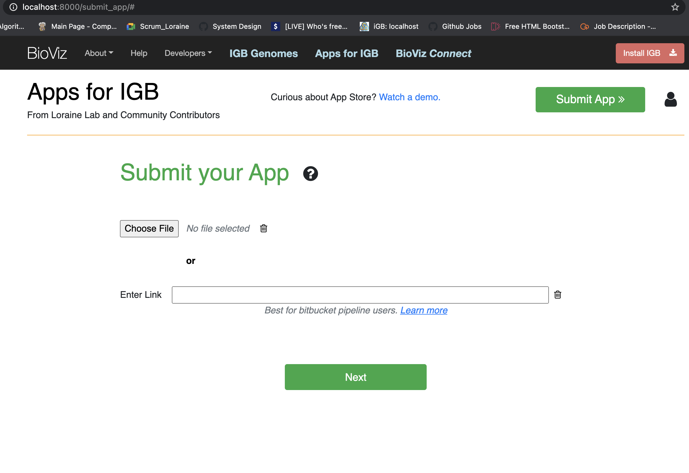
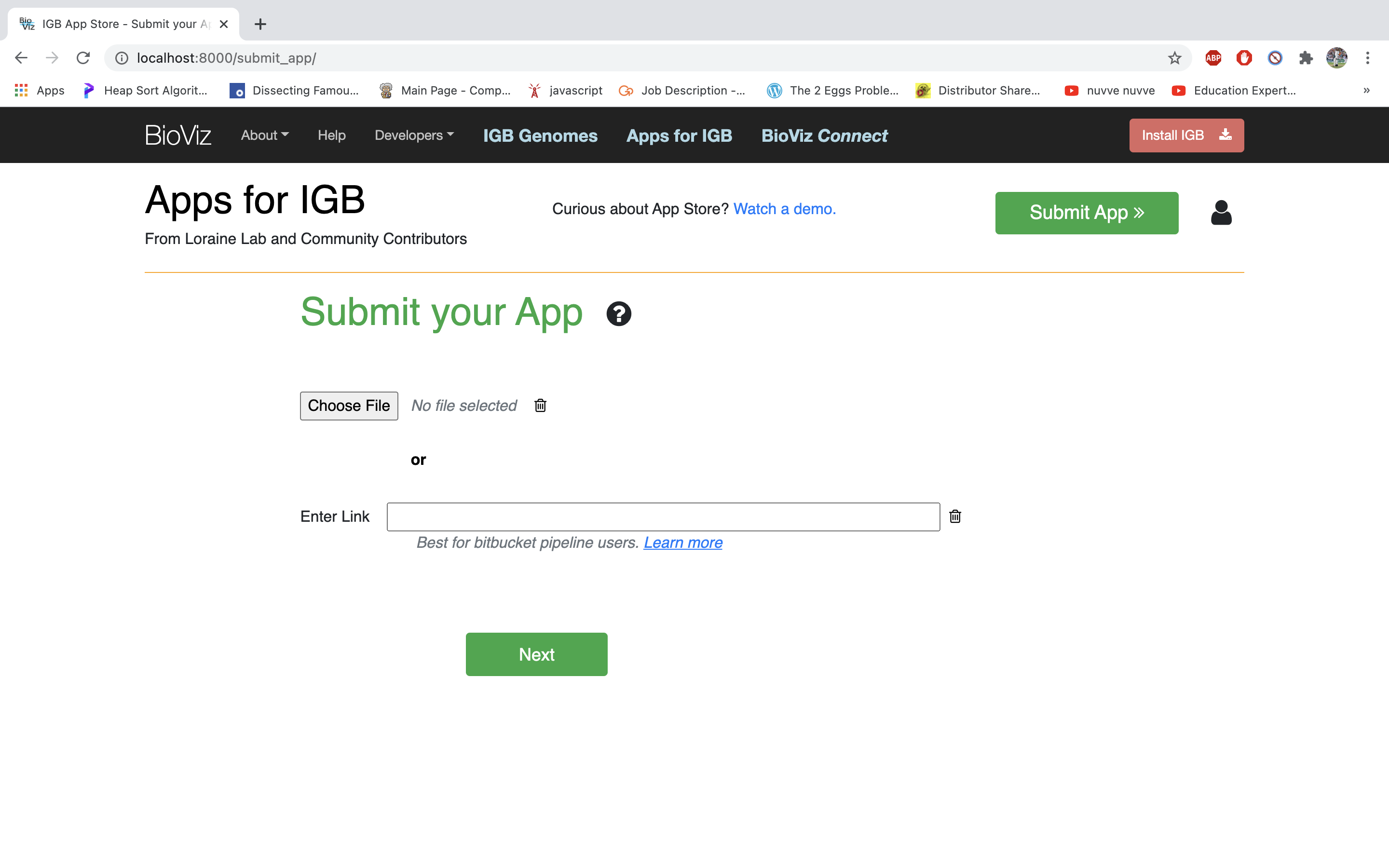
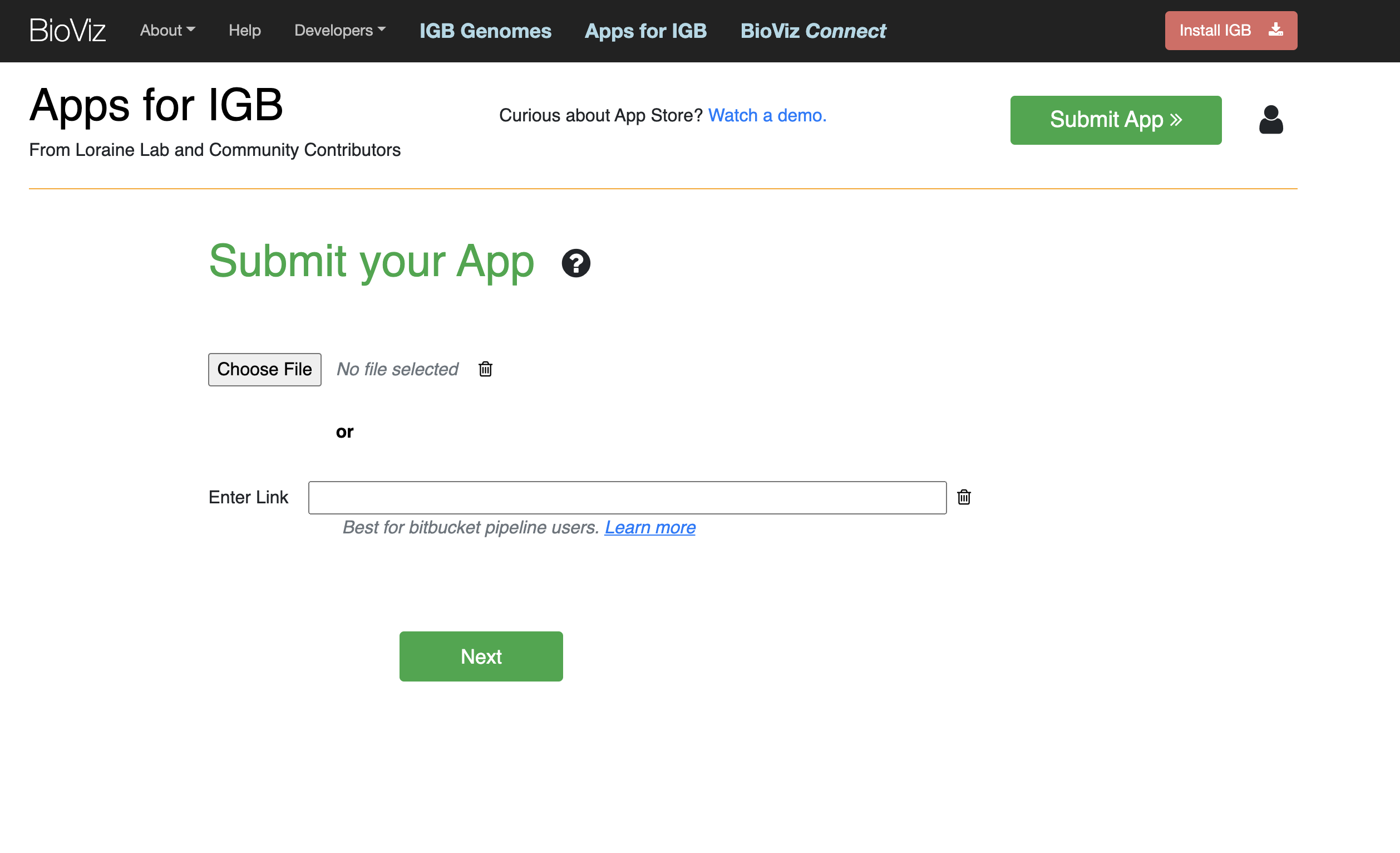
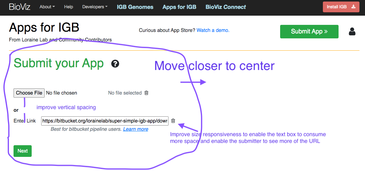
The current "Submit your App" page looks very unbalanced because all the content text is pushed over to the left side of the page, leaving a large white area on the right. Also, the space between elements a bit uneven. For example, the "No file chosen" label has only a small amount of space between it and the "Choose File" button. It looks a bit cramped and uneven.
Try moving the content so that it occupies the center of the page, but continues to be left-justified. Also improve the layout of the elements so that it looks more even and harmonious.
Test your design by viewing the page at different magnifications and different window sizes.
Attachments
Issue Links
- relates to
-
-
- Closed
-