Why are we putting an enormous QR code image on the flyer? How does that help build brand recognition for IGB?
Instead, put something in the center of the flyer that looks amazing and shows off the Integrated Genome Browser. We have lots and lots and lots of images that could work for this. Maybe the next best step is to describe what we want to show and then we can make something that will perfectly fit the format and document size.
Change request: Replace the web site QR code with an image from IGB.
Please understand that QR codes are mainly for people to avoid the hassle of typing in a very long, hard-to-remember URL. They also help a bit with tracking page views. Making a QR code that goes to bioviz.org is overkill. Plus, QR codes are mainly conveniences for people using devices with cameras to view internet content - mobile devices. You can't actually install IGB on a mobile device, so it's a little weird that we would recommend using a QR code to go to our download site.
Instead, we should put a graphic of IGB front and center, so that users can tell at a glance, without even reading the text, what the flyer is about. We should use an image that distinguishes IGB from all other genome browsers - like the start screen, or maybe an image showing a stack of the track types IGB can create.
Then, next to the information about the help session, we can provide a different QR code that opens a page to the help session.
Lastly, where did this QR code come from? Can we change it later if the Web address it points to changes or becomes obsolete? For example, I often use "bit.ly" to make QR codes. I have an account that lets me make track the usage, which is nice. And, if I need to, I can make changes to the URL the QR code points to.
In future, if you need a QR code for something, we need to use a lab account of some type so that more than just one person can manage it.
I recommend create QR codes for the IGB User's Guide and another one for the help sessions page.
Task
Major
IGBF-3969 Update outreach flyer
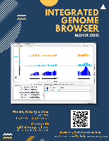
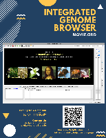
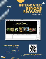
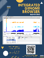





I created a flyer with Canva, see attached.
For review, address the design, if there are any additional pieces of information that needs to be added, and any recommended changes.