Details
-
Type:
New Feature
-
Status: Closed (View Workflow)
-
Priority:
 Major
Major
-
Resolution: Done
-
Affects Version/s: None
-
Fix Version/s: None
-
Labels:
-
Story Points:2
-
Epic Link:
-
Sprint:Summer 2019 Sprint 10, Summer 2019 Sprint 11, Summer 2019 Sprint 12
Description
To Redesign IGB Logo for further use.
Attachments


Issue Links
Activity
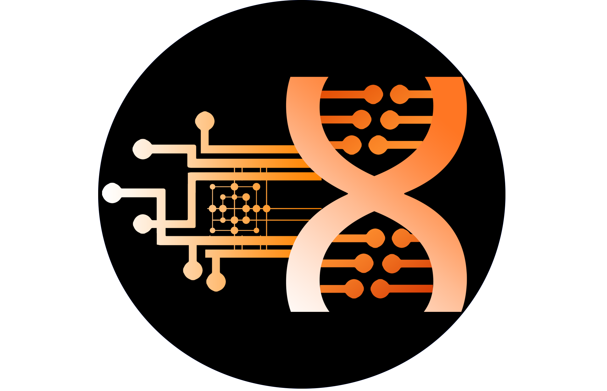
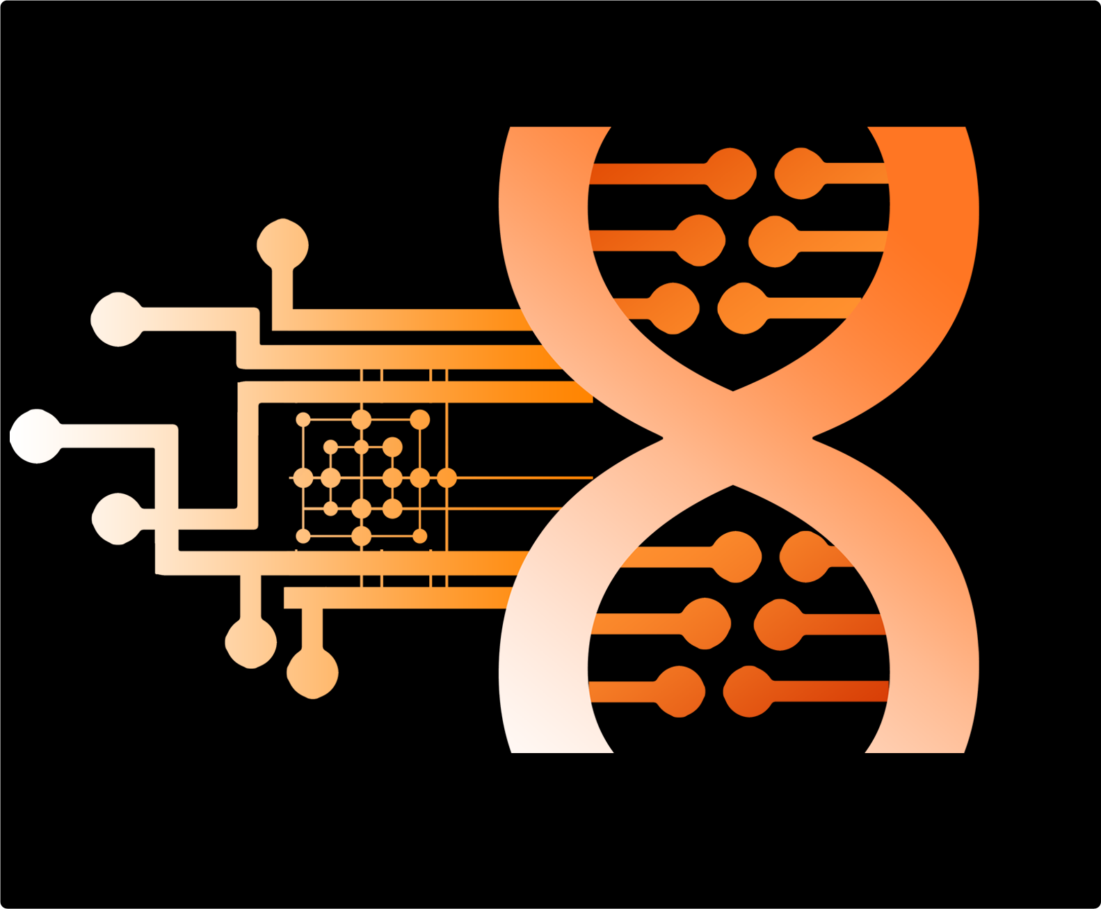
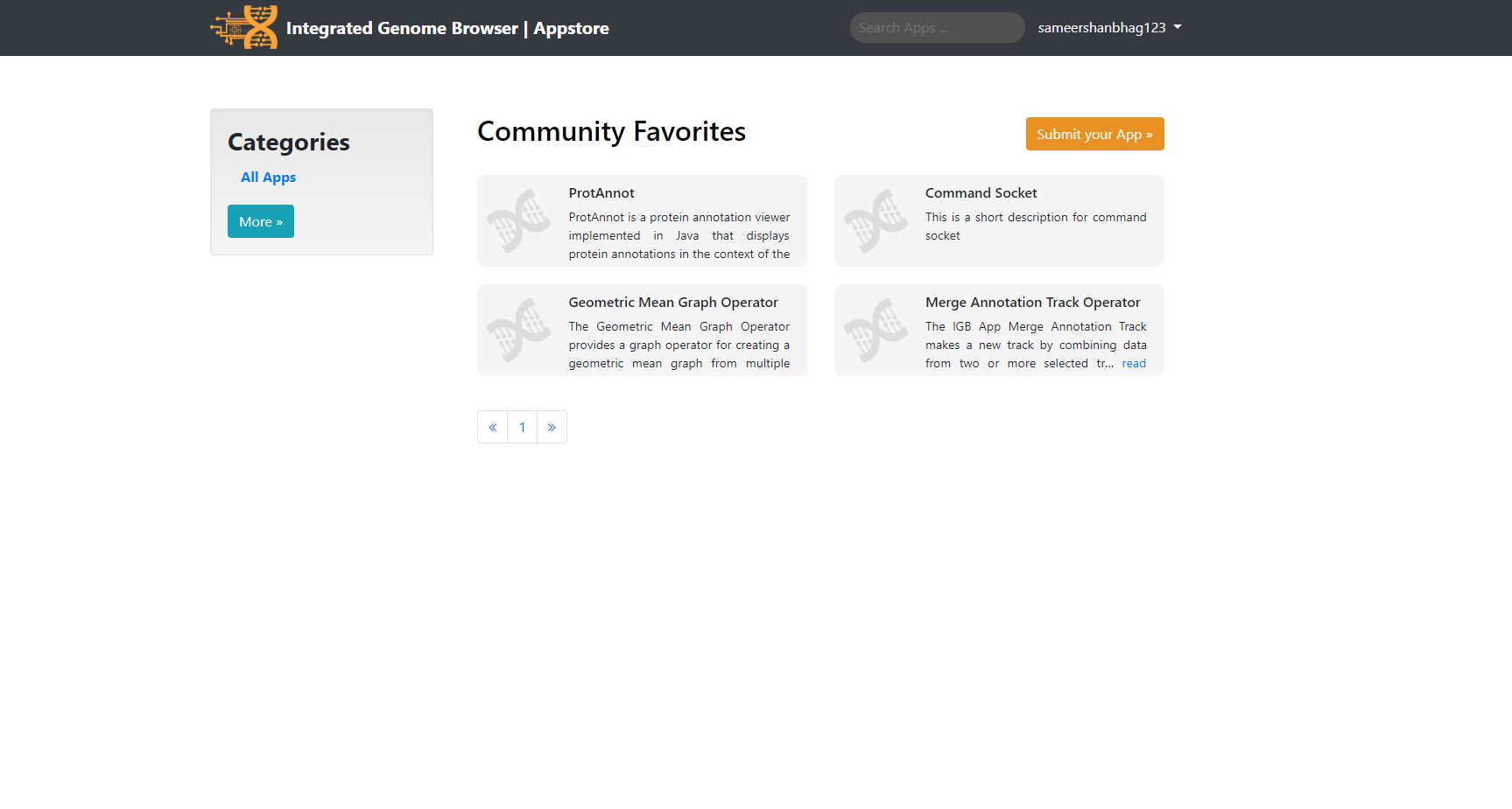
I have a Mock Appstore Layout Design Attached to this Thread by the name "Demo App.png". That is how I propose the Appstore must look like. Please Check the same and let me know if any changes are required.
Thank you so much Sameer for creating this! You have many talents!
I would like to see another iteration. When shown large, the images look terrific, but when shrunk to the size needed for the upper bar, the highly detailed parts on the left are so hard to see. The gray logo used as the "default" in the tiles works much better, though!
Some thoughts on the meaning of the image:
The iconography - circuit diagram merged with DNA graphic - seems like it would work great if we were doing DNA computing, which is actually a thing that is happening right now! See: https://en.wikipedia.org/wiki/DNA_computing
I think we need something different that evokes some different concepts.
For the IGB logo itself, we need a graphic that is distinctive, striking, and impossible to mistake for something else.
Ideally, it should look friendly – something that a non-scientist would see and feel that the data they will view in IGB can be trusted. Also, they need to feel that they can trust us – the developers – not to try to sell their data to anyone or otherwise take advantage of them. That is partly why we have shown images of the Mona Lisa, animals, plants, and microbes on the IGB start screen. The Mona Lisa painting is very famous and symbolizes a great achievement of an individual human being. It is supposed to make people feel that this application will respect their humanity and individuality.
For the IGB logo, I would love for us to evoke an idea that the human race and all organisms are infinitely fascinating, and that visualizing one's own personal genome can make a person feel more connected with human history and also the history of life on earth.
Another key idea is that the Integrated Genome Browser is integrated .... you can look at many different genomes from many different species, and you can also look at data provided by different scientific institutions from all over the world.
We are also trying to teach people about their own personal genome by explaining how it relates a single reference genome that belongs to everybody. Our software is completely free and open – everyone can use it.
Ideas and concepts related to this:
- togetherness, compatibility, humanistic
- integration – like the two strands of DNA united and running in opposite directions, in a kind of spiral
- comparing yourself to others in order to better understand and enjoy your own uniqueness, and theirs
- by comparing thousands to each other, you learn what makes an individual unique
The App Store logo does not have to be same as the IGB logo, but if we can use one image for both, that would be good.
The App Store is a place for users to download and upload new tools. So the App Store logo can evoke tools and useful things to enhance IGB and make it richer and better.
Thanks for the Input Professor.
I will look into it and see if I can make something related to the Ideas mentioned above.
Hi Prof. [~aloraine]
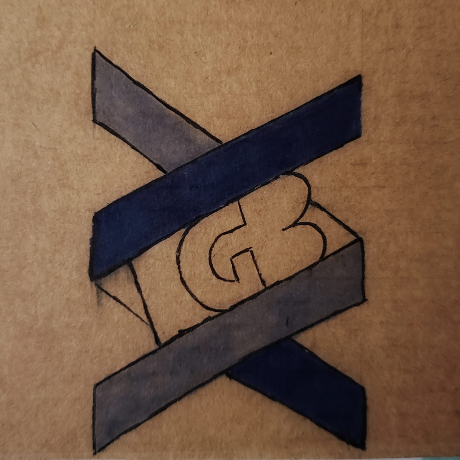
I have added the Logo 1, Logo 2 and the App Generic Icon to this thread for future reference.
Thank you Sameer for the designs.
Am closing this for now.
[~aloraine] Nowlan Freese
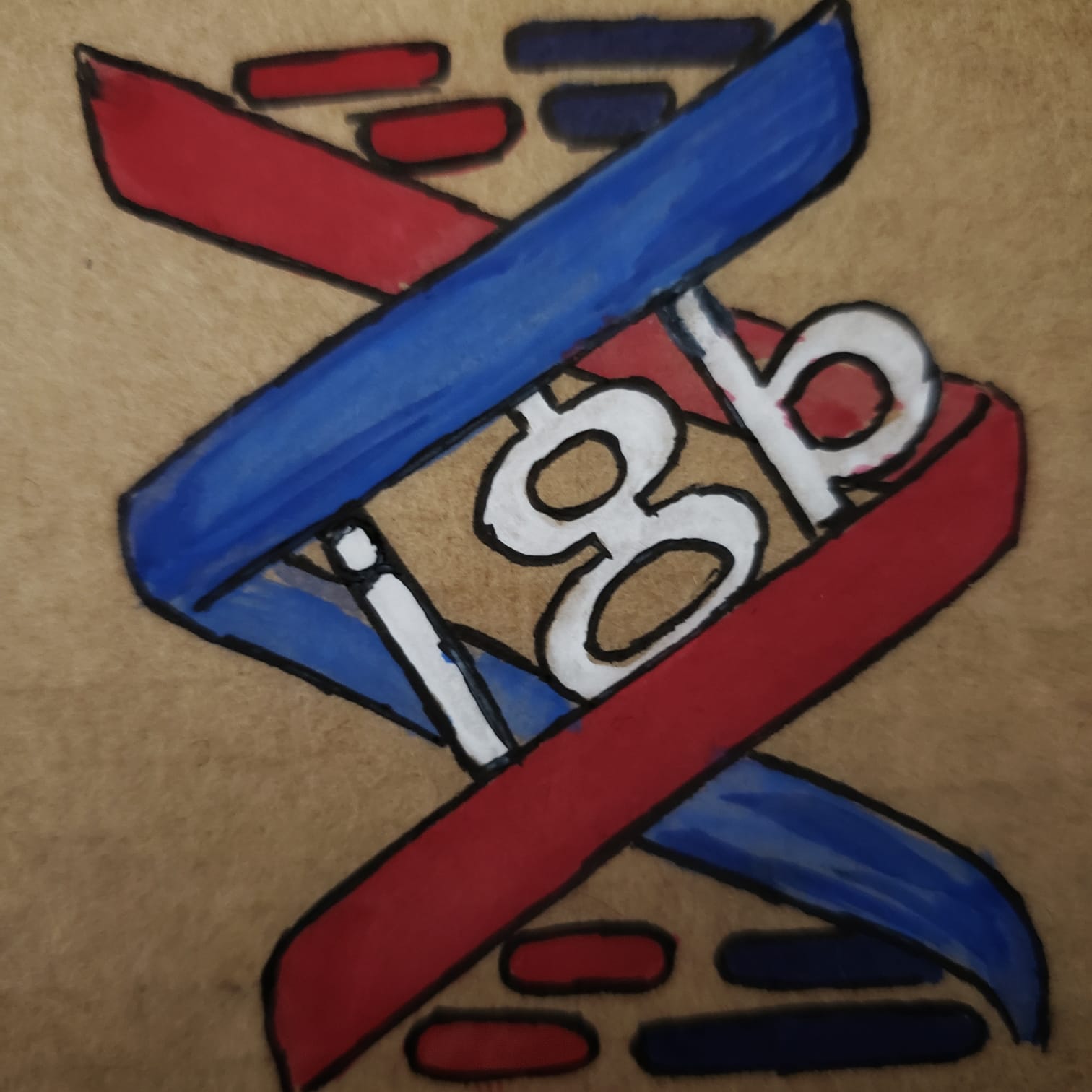
I came up with the above design for the Appstore Logo or the logo in general. Please have a look at it and let me know if you need me to change anything or any new idea would be awesome.
Colors can be changed as required.