Details
-
Type:
Improvement
-
Status: First Level Review in Progress (View Workflow)
-
Priority:
 Blocker
-
Resolution: Unresolved
-
Affects Version/s: None
-
Fix Version/s: None
-
Labels:None
-
Story Points:4
-
Epic Link:
-
Sprint:Spring 2 2021 Apr 5 - Apr 16, Spring 3 2021 Apr 19 - Apr 30, Spring 4 2021 May 3 - May 14, Spring 5 2021 May 17 - May 28, Spring 6 2021 May 31 - June 11, Summer 1 2021 Jun 14 - Jun 25, Summer 2 2021 Jun 28 - Jul 9, Summer 3 2021 Jul 12 - Jul 23, Summer 4 2021 Aug 2 - Aug 13, Fall 1 2021 Aug 16 - Aug 27, Fall 2 2021 Aug 30 - Sep10, Fall 3 2021 Sep 13 - Sep 24, Fall 4 2021 Sep 27 - Oct 8
Description
Currently, if the stack height is too small to show all feature in a track, IGB draws a summary row at the top of the every track which contains Glyphs that are drawn on top of each other.
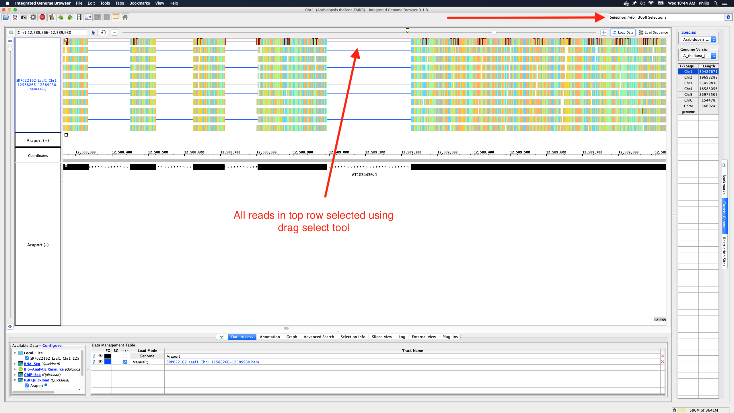
To save memory and speed up computation, not all data items are drawn and rendered into Glyphs in this top row. However, if you click-drag (rubber-banding) over the summary row to select everything that it is there, the "Selection Info" text box reports the correct number of items expected to be there.
One problem with summary row representation, however, is that it can be a bit misleading. For example, some horizontal gaps may appear, leading the user to think none of the data occupy the apparently empty location.
We need a better algorithm and representation style that will suggest to the user that:
- Individual data items are not being shown
- Any region that looks empty, really is empty (i.e., no data items from the track overlap it)
Some ideas:
- Please don't draw a histogram-style graph. The "summary" row is too short for that.
- Heatmap might be OK.
- We can show consecutive blocks with positive space and negative space only, where negative space indicates the absence of data
- We can show consecutive blocks with color intensity (or transparency) indicating the amount of data items underneath them
- Instead of drawing the summary row as a series of blocks, draw ellipses (tiny squares) in the top row wherever there is data.
In the above implementations, the summary row glyphs would not need to be selectable or countable. If a user wants to count features, they can instead set the stack height to everything being shown, collapse the track, and then click-drag over the collapsed track region.
Attachments

Activity
Investigation of existing summary row implementations, when loading aligned RNA reads:
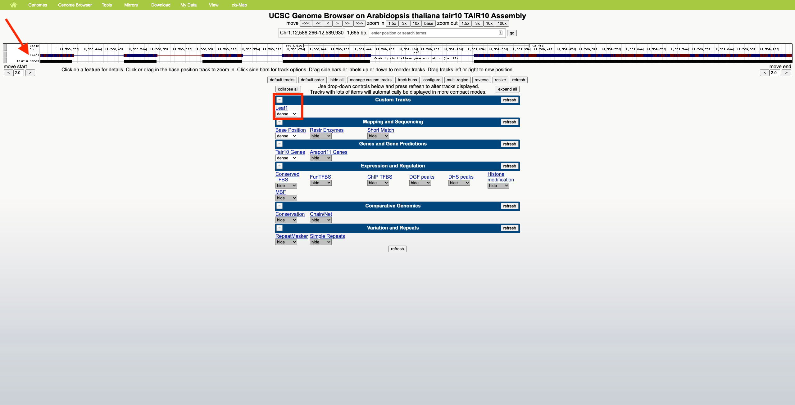
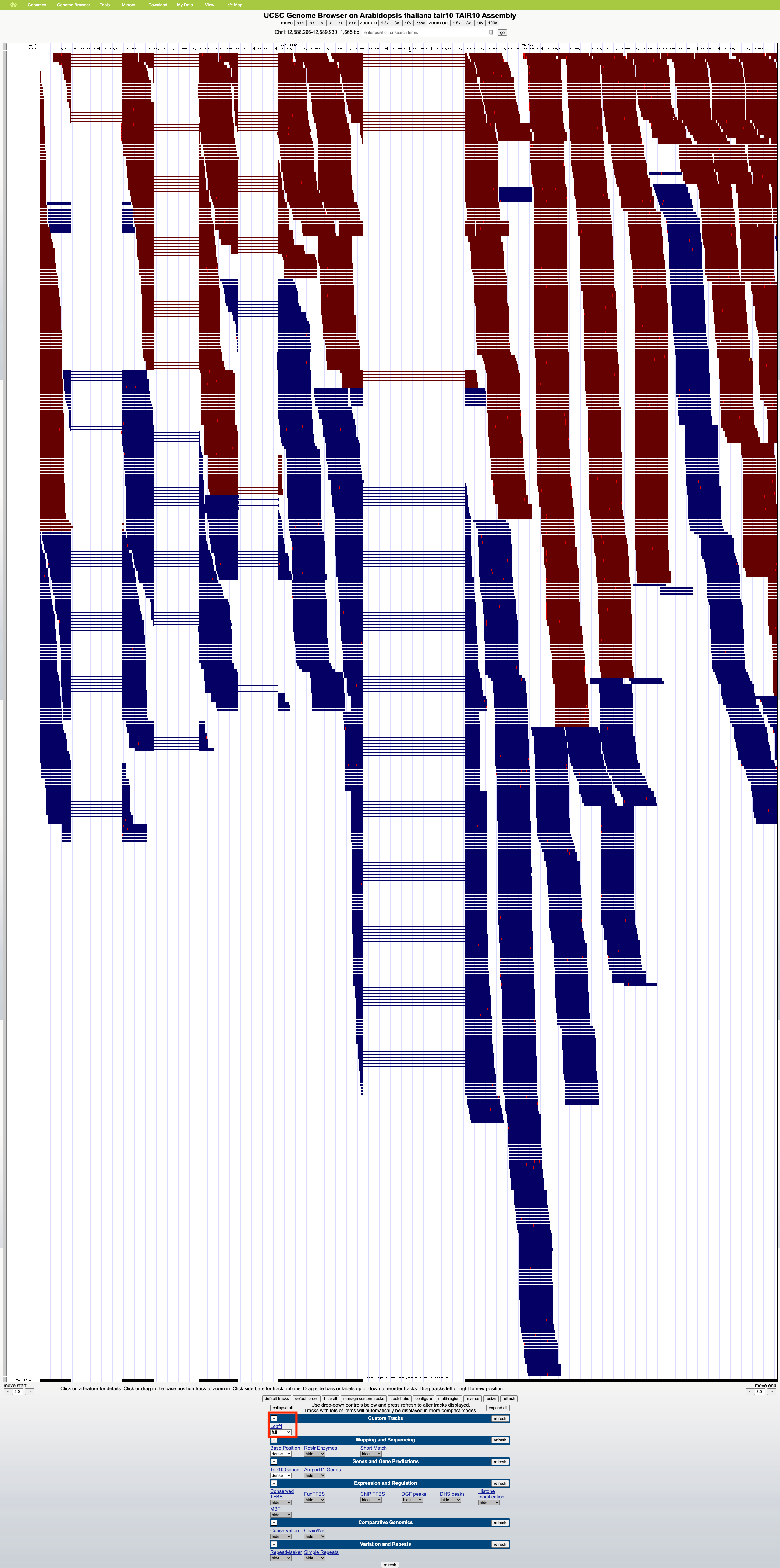
- UCSC Genome Browser
- No summary row. Zoom seems to only occur horizontally; reads maintain a constant height.
- Scrolling in the web browser is allowed on regions of high read coverage, and the amount of scrolling depends on the selected display mode (dense, squish, pack, full), which affects read height.
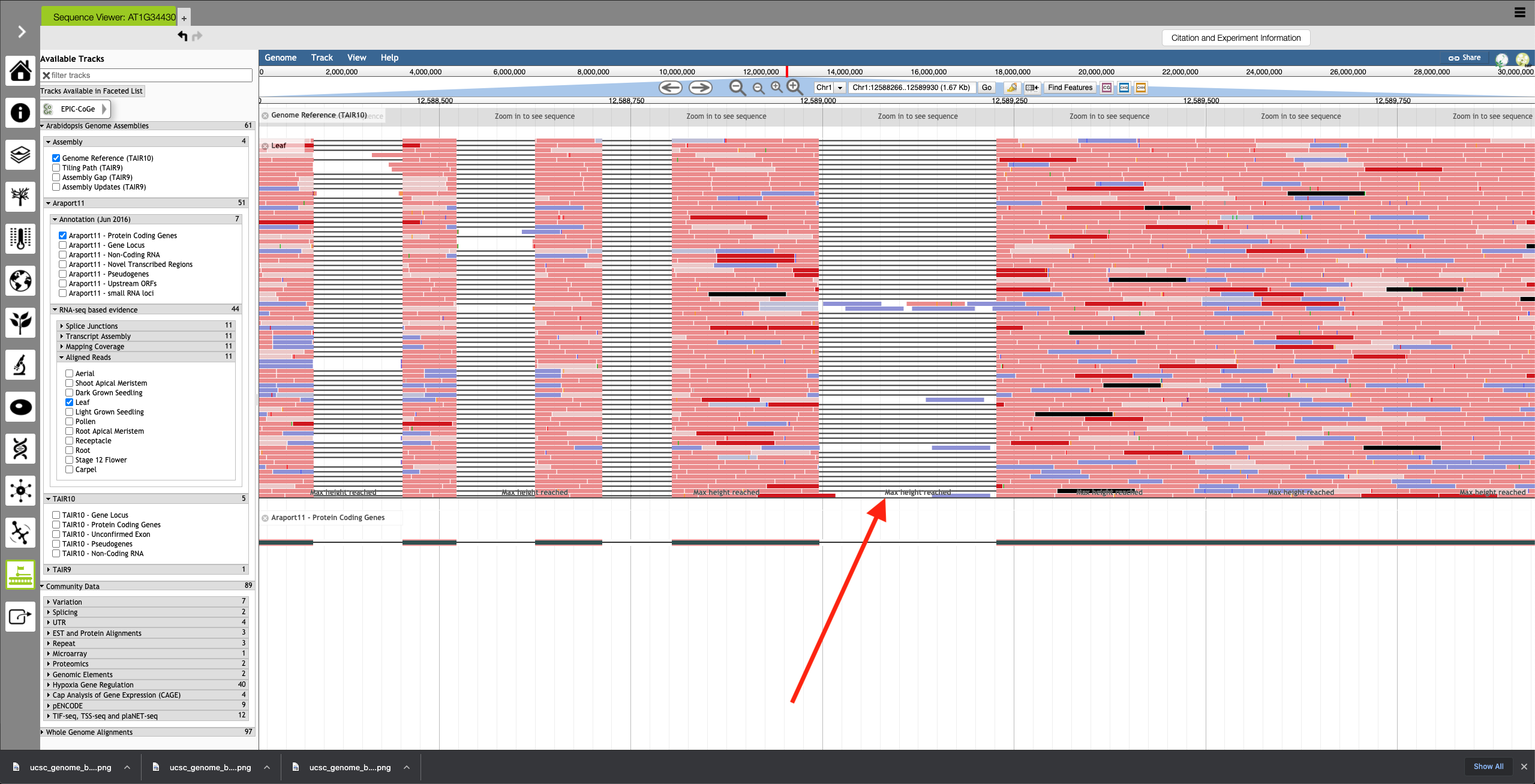
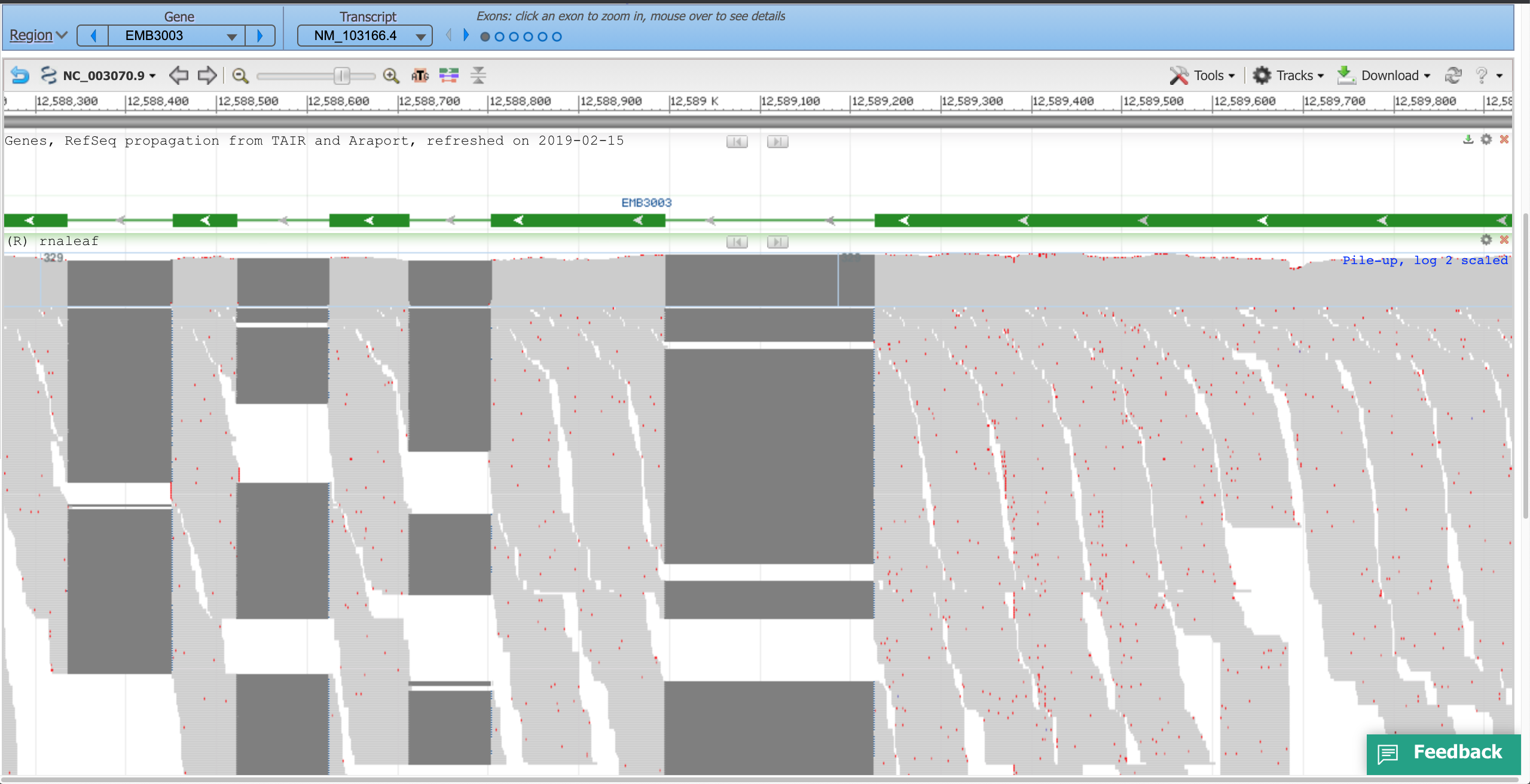
- ePlant JBrowse (AT1G34430.1)
- No summary row. Only horizontal zoom is available, as with UCSC. No compaction display mode options.
- Regions of high coverage are cut off, with the message 'Max height reached' shown.
- NCBI genome browser
- Shows all reads, extending the browser page vertically. Only horizontal zoom is available.
- No summary row, but a log 2 scaled pileup graph is present above the reads.
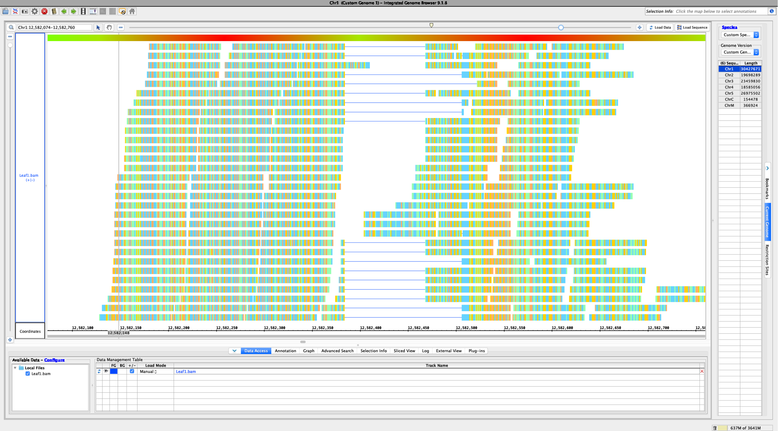
- IGV
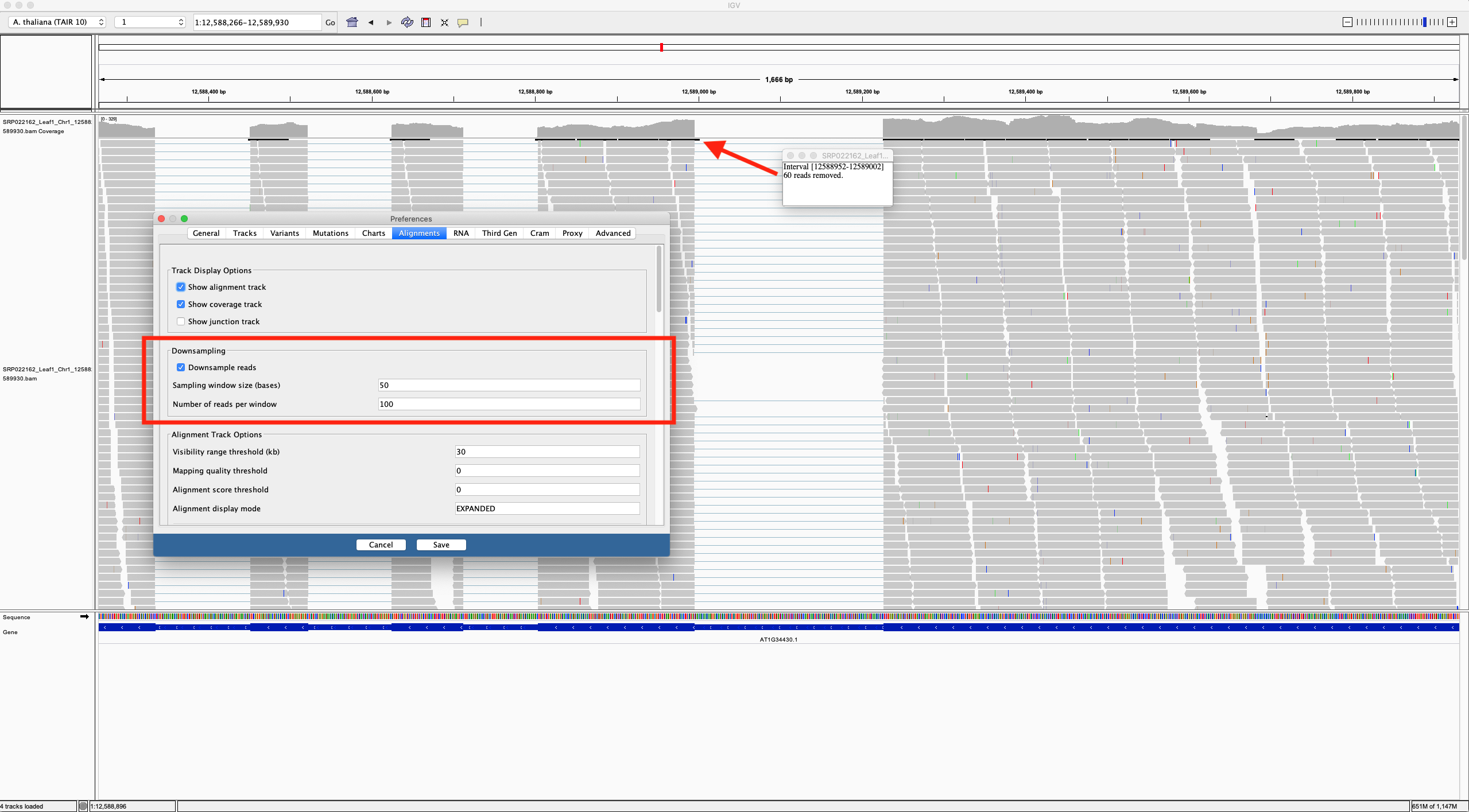
- Only seems to have horizontal zoom on aligned RNA reads. Coverage graph is present above reads, and setting the track height in pixels only seems to affect the coverage graph, not the reads, which maintain the same vertical height across zoom levels. Areas of high coverage are downsampled based on thresholds set in the preferences, with black boxes shown in the top row of the RNA track, indicating how many reads have been omitted.
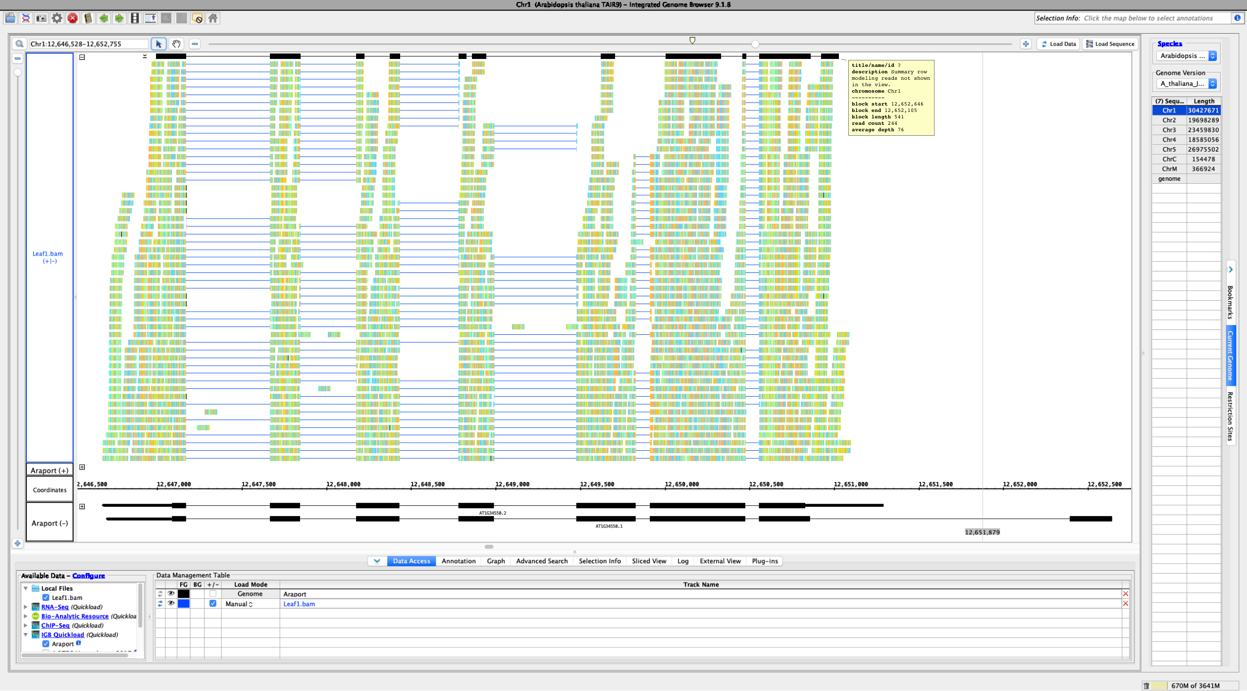
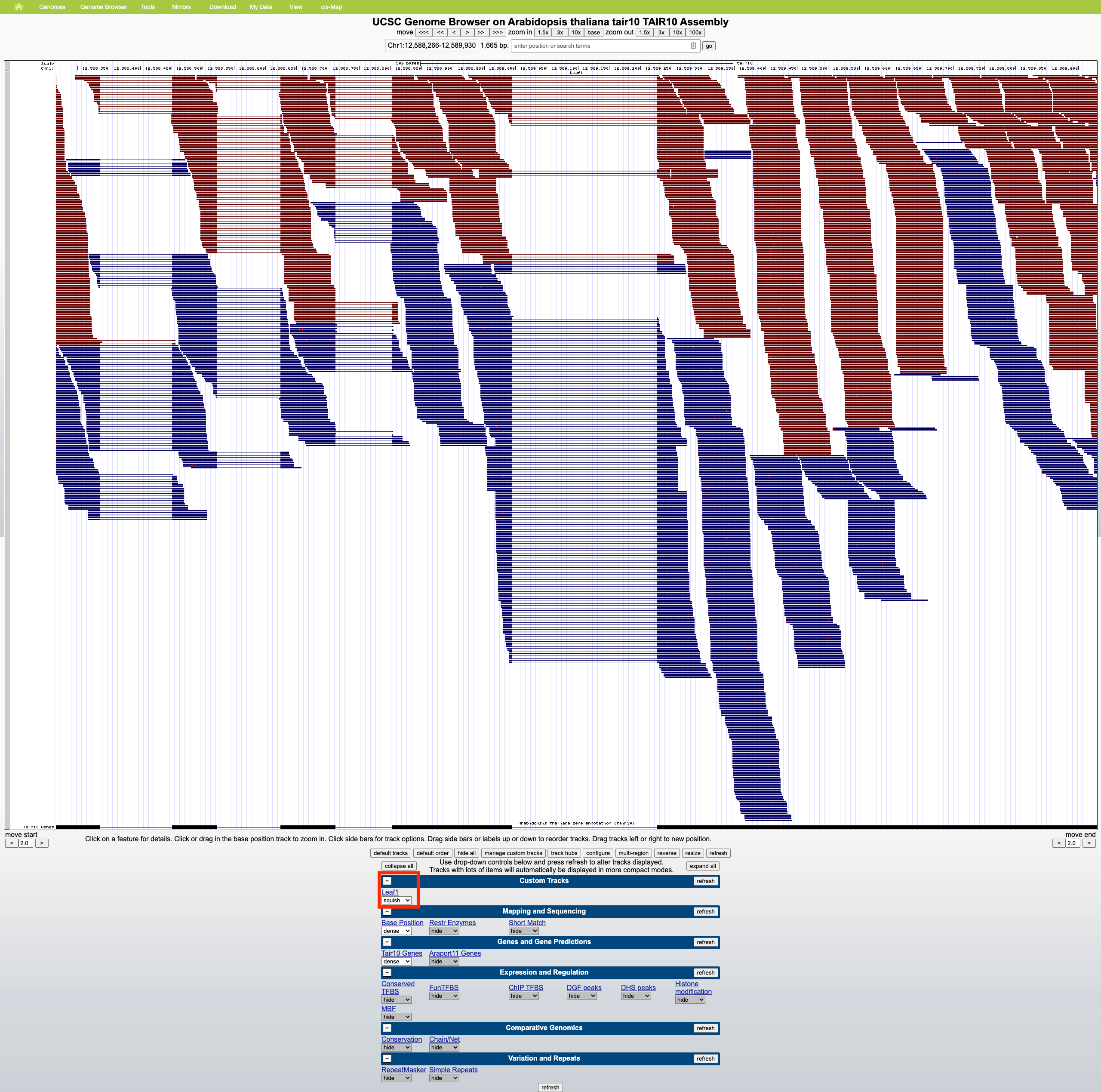
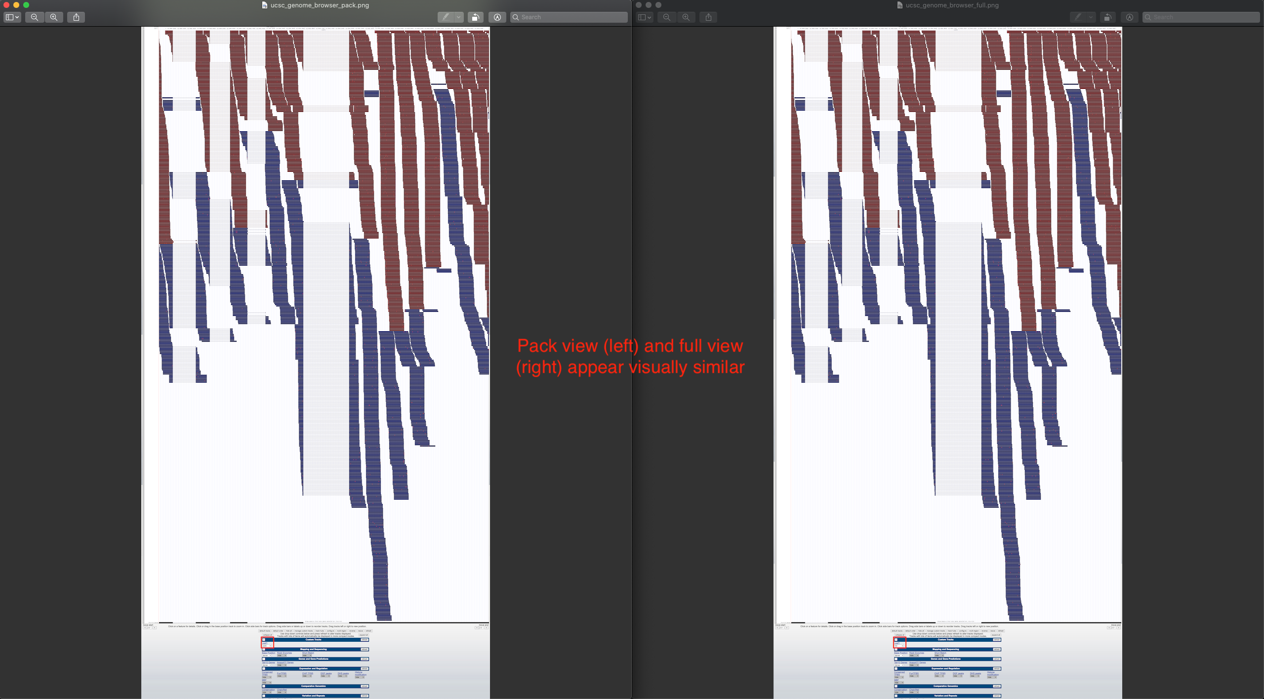
Using a sample reference RNA BAM file (or the full file available here), visual differences between some of the genome browsers can be seen in the attached screenshots. The region of interest is Chr1:12588266-12589930.
Try ePlant at BioAnalytic Resource - University of Toronto
also look at the associated paper - http://www.plantcell.org/content/29/8/1806
Genome browsers are commonly used to visualize large amounts of data that cannot otherwise be easily made sense of in their raw form. One such type of data are the aligned RNA reads of transcriptomic experiments. Each read is drawn over the assembly nucleotide axis, covering some portion of its parent gene, and each gene can contain zero to many corresponding reads, based on sequencing depth and the extent of expression. This results in a range of possible read content at a particular assembly locus, and at the higher extremes, viewing all reads on a single screen is either impossible based on resolution constraints, highly computationally intensive, or simply not useful. As a result, most genome browsers set the read height to a constant (and sometimes configurable) value and either do not display reads that cannot fit onto the screen/view, allow for vertical scrolling across the reads, or summarize the reads that could not be shown in some way. IGB, for example, creates a summary row at the top of each aligned read track, that is meant to represent the reads that do not fit into the track view and differs based on track height and read height. This summary row consists of an overlapping collection of the read glyphs that could not be shown, however, two primary issues exist with the current implementation, which are common to genome browsers a similar version of this feature, such as IGV:
- It is often unclear to users what the summary row is meant to represent, due to a lack of visual distinction from regular track rows and no description of its functionality.
- The summary row does not represent all the reads omitted from the view, but rather only a subset.
In order to make the summary row in IGB more useful, it must be clear to users what it represents and this representation must be useful. An arbitrarily subsampled summary of omitted reads may be more misleading than helpful. To improve this feature, a more computationally efficient and self-evident visual representation of omitted reads can be designed. I think that a good solution could be to draw glyphs that contain nucleotide-level color gradations based the amount of omitted read data that is present at a particular locus. A two color gradient could be used and made to be user configurable. Colors could also be based on nucleotide bins of configurable lengths. This representation of the summary row would clearly differentiate it from the other rows in the aligned read track and would be representative of all the omitted reads. I will work on some prototypes.
See Developer's Guide for info on how to make EST data file to view in IGB.
Given that a summary row may be associated with any annotation track containing more rows than the set stack height, this problem is associated with tracks that may contain different glyph shapes as means of data representation. It may be, therefore, more reasonable to maintain the current implementation of glyph drawing in the summary row and only add the following changes, to improve the summary row:
- Remove the current subsampling of annotation track rows in the summary row - summarize all rows beyond the stack height.
- Will need to test if performance hit is observed and whether it’s due to backend algorithm or graphics rendering. In the former case, the algorithm may be optimized; in the latter case, given that preserving annotation count in the summary row is a requirement, improving performance may be difficult. Performance also varies by machine/hardware configuration, so it may be useful to allow configurable subsampling, as IGV does, for lower end machines.
- Change the color of the summary row glyphs - glyph colors vary between annotation tracks, so summary row glyph color may be set to a contrasting value on a per-track basis, or a universal color offset can be used.
- Add an additional entry to each summary row top-level glyph tooltip, indicating that summary row status, e.g. a description field.
- Add top-aligned text indicating that the top row is a summary row, when it is, to the annotation track label box.
The dropbox link for A Practical Guide To Usability Testing for reference
I have been looking at the following files to change the summary row to show all annotations that do not fit into an annotation track's stack height:
- $IGB/core/igb/src/main/java/com/affymetrix/igb/glyph/AnnotationTierGlyph.java
- $IGB/core/igb/src/main/java/com/affymetrix/igb/glyph/DefaultTierGlyph.java
- $IGB/core/igb/src/main/java/com/affymetrix/igb/view/factories/AnnotationGlyphFactory.java
Notes:
- Each track has an associated 'Tier' glyph.
- Each Tier glyph has one or more child glyphs that are arranged into rows using syms and spans.
- Stack height may be set in the IGB Annotation pane and limits the number of rows shown in each track.
- Rows beyond the stack height limit are drawn one over the other in the summary row (currently limited to an overlap depth of 10).
- Removing the depth limit results in a significant increase in data loading time and sluggish feedback to user interactions afterward.
- There seems to be an initial spike in CPU and GPU activity, but something causes summary row loading to continue after this. I noticed that draw methods are invoked without user interaction at times - this may be the cause. Memory usage change is low.
Please see my branch to follow my testing of this issue.
Objective:
- Combine all glyphs/rows of the summary row into a single row of glyphs prior to rendering/drawing.
[~aloraine], please see a commit of my latest work here.
Suggestion: Open latest human genome and visit MEOX1. Load RNA-Seq reads from heart to observe slop row behavior.