Details
-
Type:
Improvement
-
Status: First Level Review in Progress (View Workflow)
-
Priority:
 Blocker
-
Resolution: Unresolved
-
Affects Version/s: None
-
Fix Version/s: None
-
Labels:None
-
Story Points:4
-
Epic Link:
-
Sprint:Spring 2 2021 Apr 5 - Apr 16, Spring 3 2021 Apr 19 - Apr 30, Spring 4 2021 May 3 - May 14, Spring 5 2021 May 17 - May 28, Spring 6 2021 May 31 - June 11, Summer 1 2021 Jun 14 - Jun 25, Summer 2 2021 Jun 28 - Jul 9, Summer 3 2021 Jul 12 - Jul 23, Summer 4 2021 Aug 2 - Aug 13, Fall 1 2021 Aug 16 - Aug 27, Fall 2 2021 Aug 30 - Sep10, Fall 3 2021 Sep 13 - Sep 24, Fall 4 2021 Sep 27 - Oct 8
Description
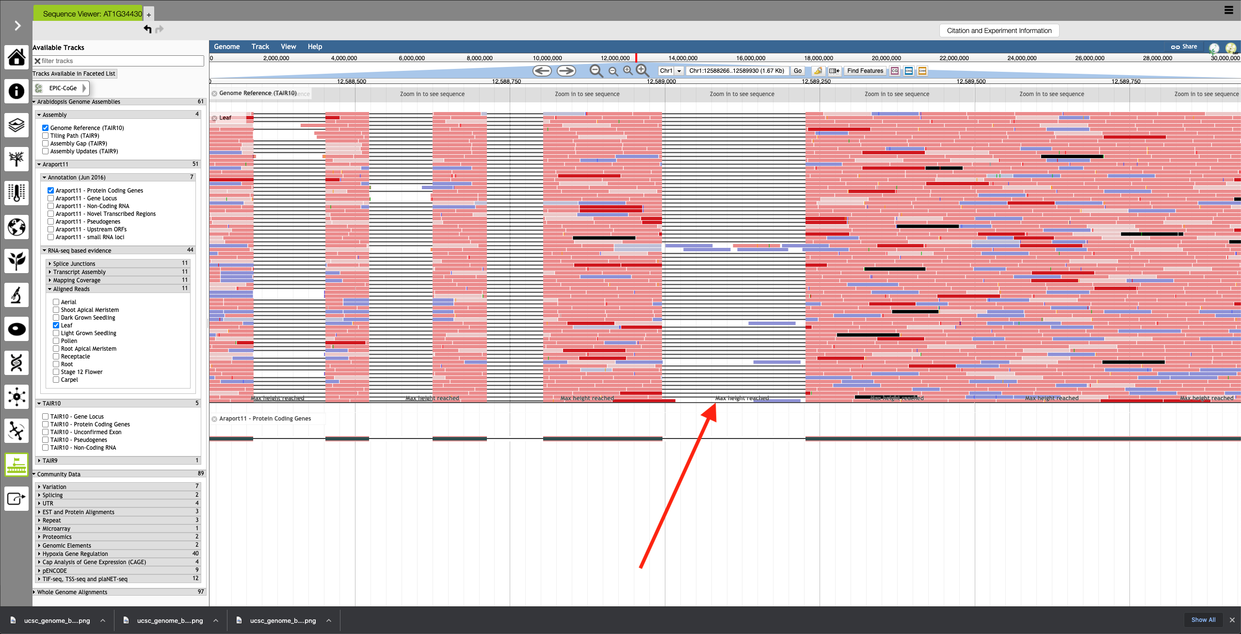
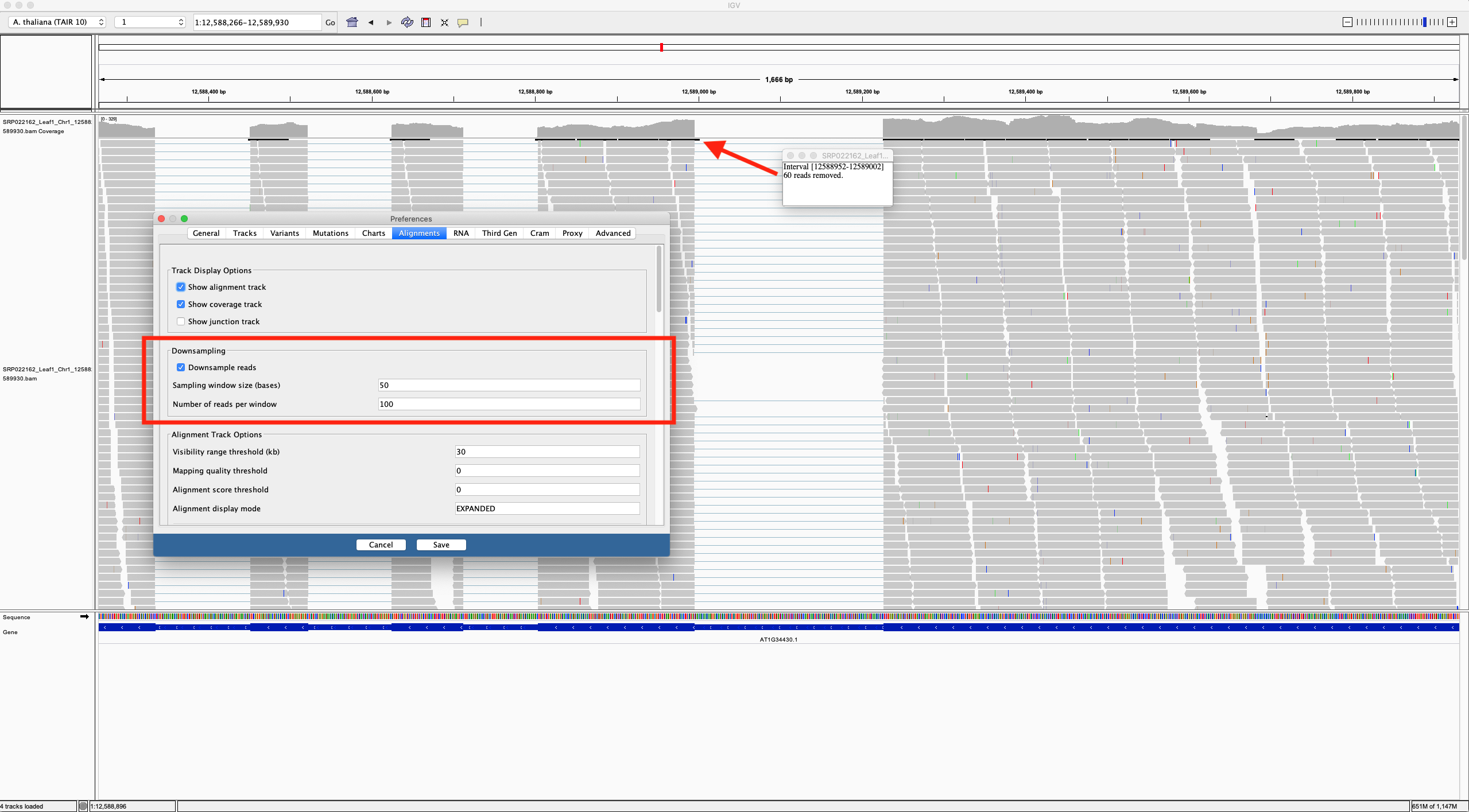
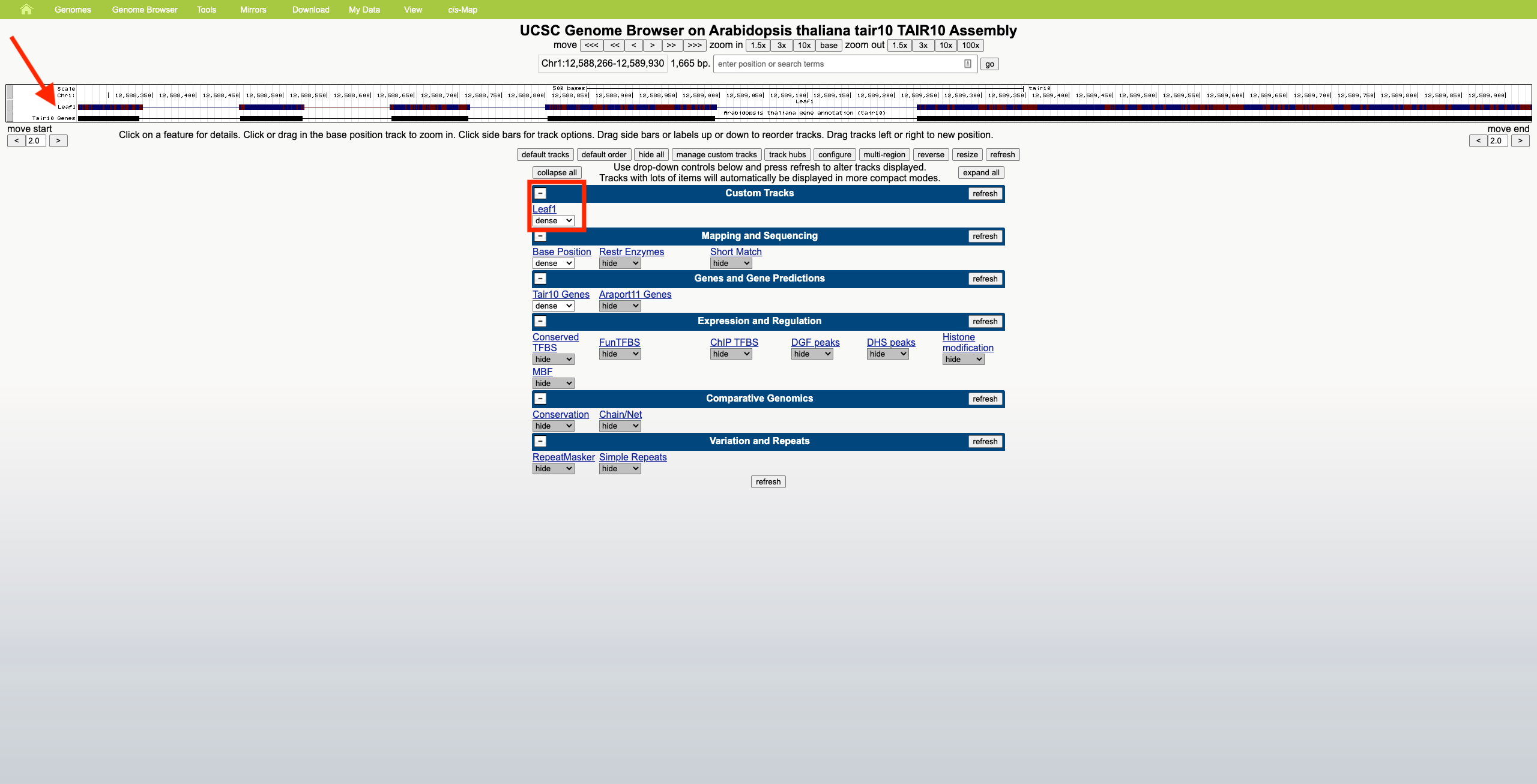
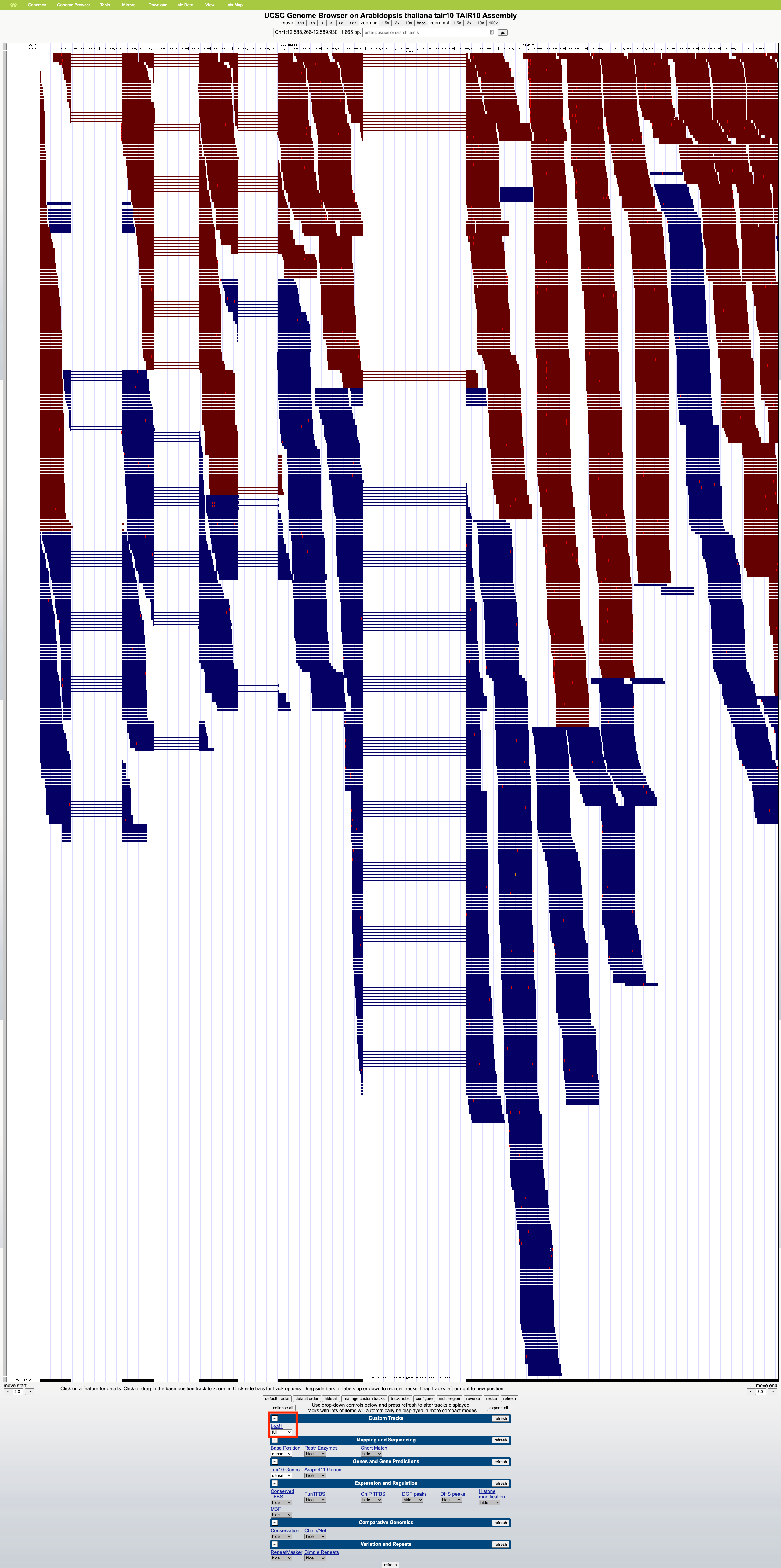
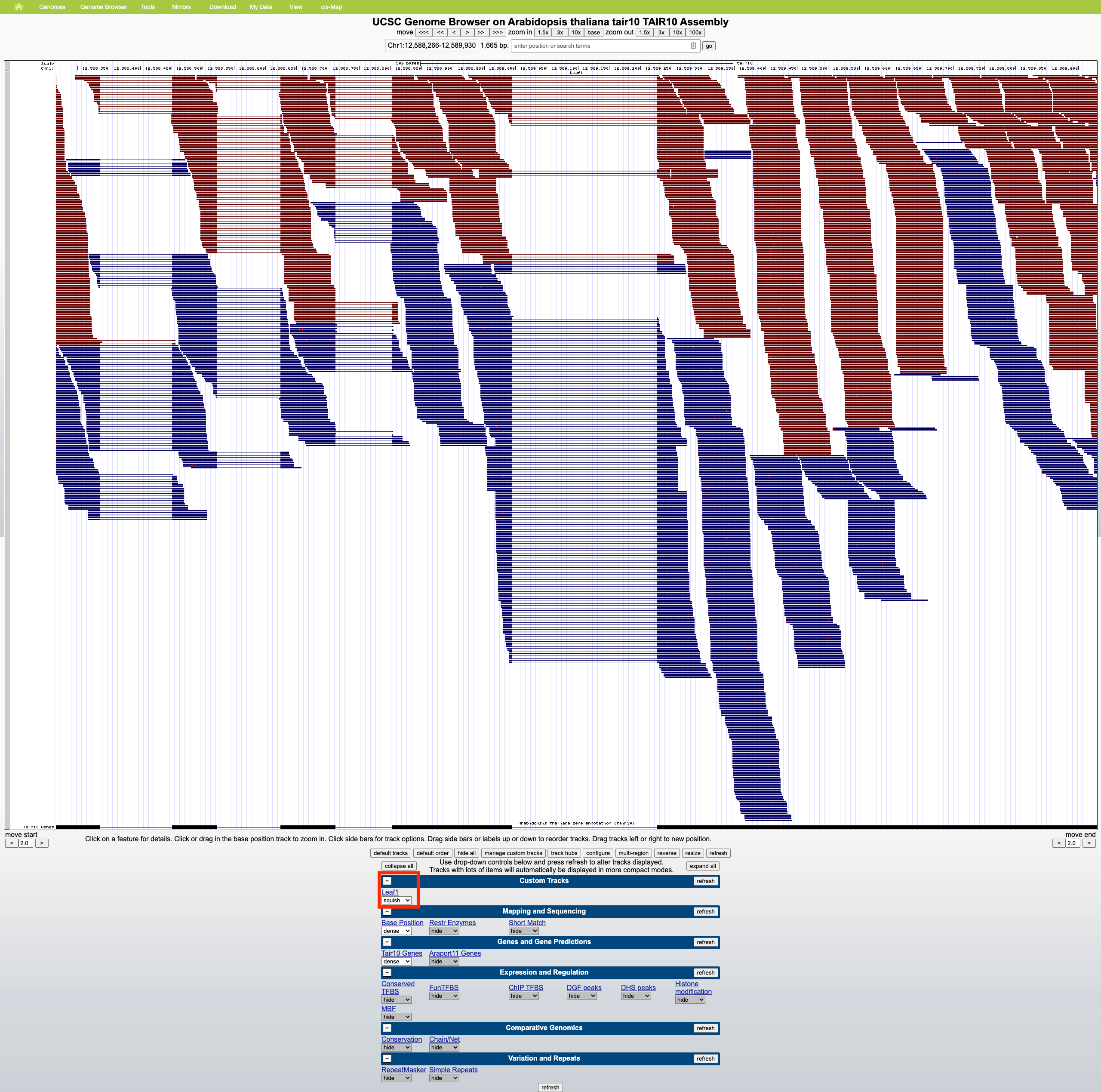
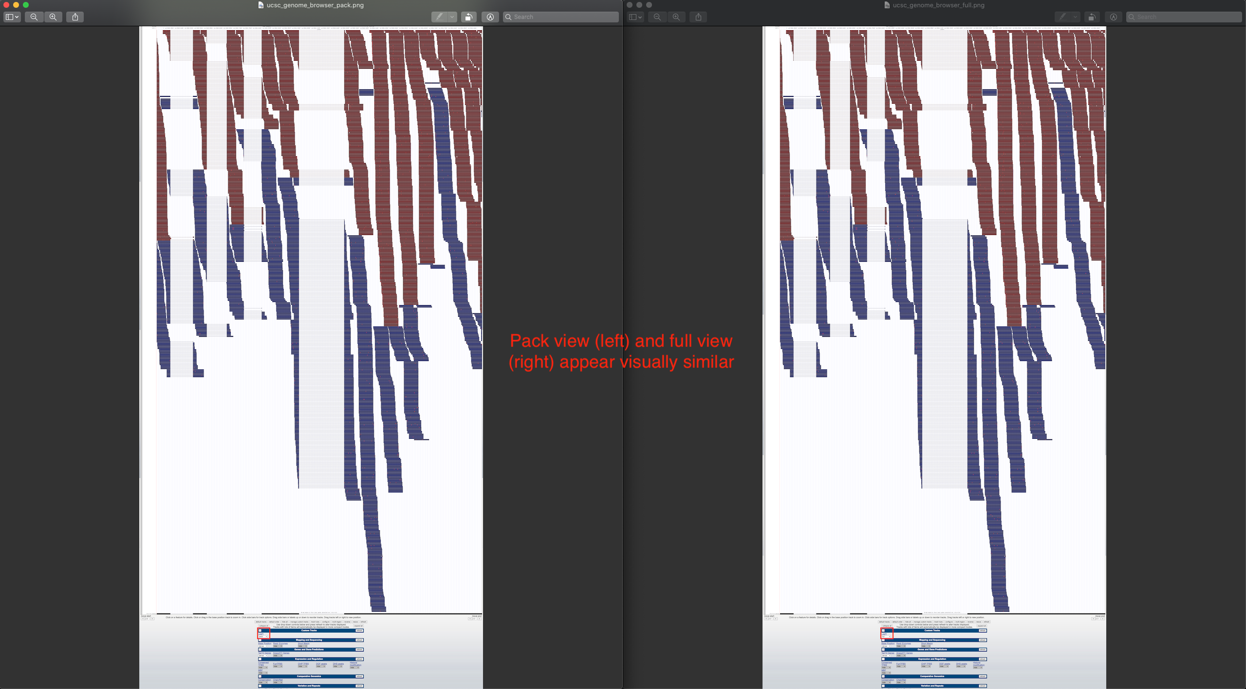
Currently, if the stack height is too small to show all feature in a track, IGB draws a summary row at the top of the every track which contains Glyphs that are drawn on top of each other.
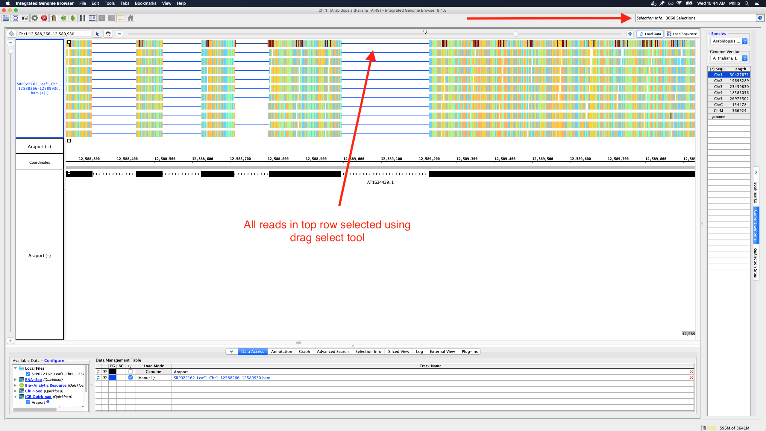
To save memory and speed up computation, not all data items are drawn and rendered into Glyphs in this top row. However, if you click-drag (rubber-banding) over the summary row to select everything that it is there, the "Selection Info" text box reports the correct number of items expected to be there.
One problem with summary row representation, however, is that it can be a bit misleading. For example, some horizontal gaps may appear, leading the user to think none of the data occupy the apparently empty location.
We need a better algorithm and representation style that will suggest to the user that:
- Individual data items are not being shown
- Any region that looks empty, really is empty (i.e., no data items from the track overlap it)
Some ideas:
- Please don't draw a histogram-style graph. The "summary" row is too short for that.
- Heatmap might be OK.
- We can show consecutive blocks with positive space and negative space only, where negative space indicates the absence of data
- We can show consecutive blocks with color intensity (or transparency) indicating the amount of data items underneath them
- Instead of drawing the summary row as a series of blocks, draw ellipses (tiny squares) in the top row wherever there is data.
In the above implementations, the summary row glyphs would not need to be selectable or countable. If a user wants to count features, they can instead set the stack height to everything being shown, collapse the track, and then click-drag over the collapsed track region.
Attachments
Activity
The dropbox link for A Practical Guide To Usability Testing for reference
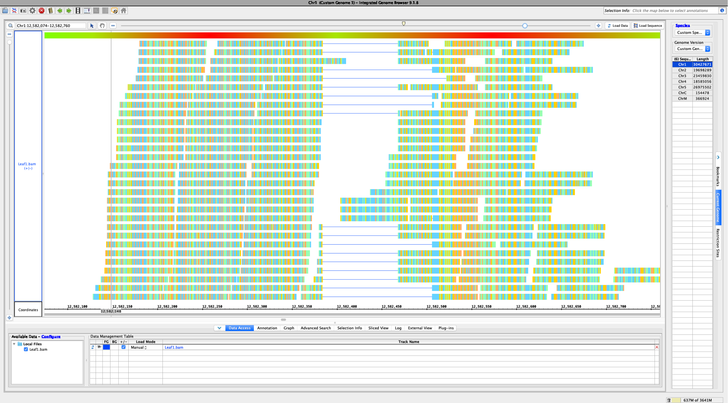
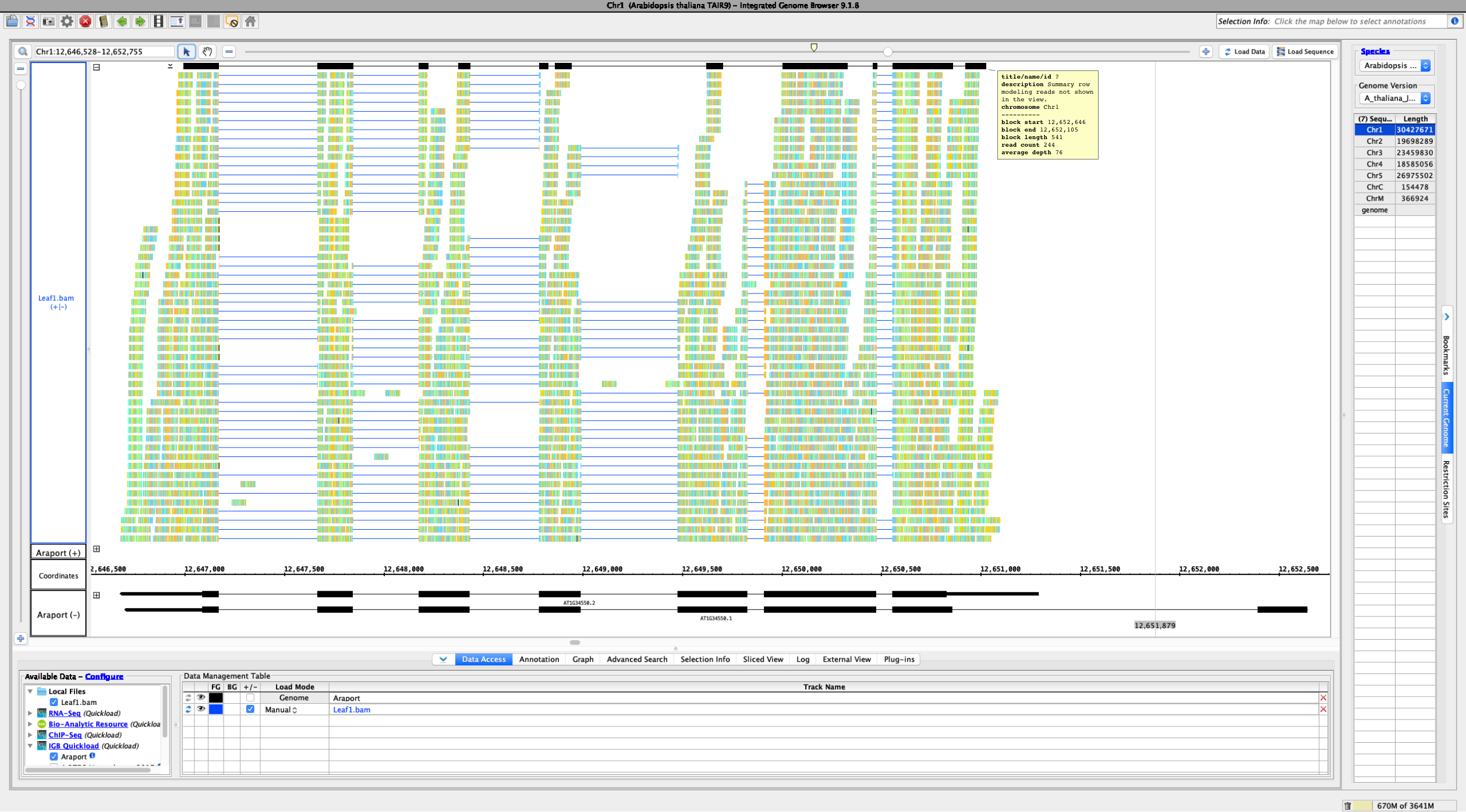
I have been looking at the following files to change the summary row to show all annotations that do not fit into an annotation track's stack height:
- $IGB/core/igb/src/main/java/com/affymetrix/igb/glyph/AnnotationTierGlyph.java
- $IGB/core/igb/src/main/java/com/affymetrix/igb/glyph/DefaultTierGlyph.java
- $IGB/core/igb/src/main/java/com/affymetrix/igb/view/factories/AnnotationGlyphFactory.java
Notes:
- Each track has an associated 'Tier' glyph.
- Each Tier glyph has one or more child glyphs that are arranged into rows using syms and spans.
- Stack height may be set in the IGB Annotation pane and limits the number of rows shown in each track.
- Rows beyond the stack height limit are drawn one over the other in the summary row (currently limited to an overlap depth of 10).
- Removing the depth limit results in a significant increase in data loading time and sluggish feedback to user interactions afterward.
- There seems to be an initial spike in CPU and GPU activity, but something causes summary row loading to continue after this. I noticed that draw methods are invoked without user interaction at times - this may be the cause. Memory usage change is low.
Please see my branch to follow my testing of this issue.
Objective:
- Combine all glyphs/rows of the summary row into a single row of glyphs prior to rendering/drawing.
[~aloraine], please see a commit of my latest work here.
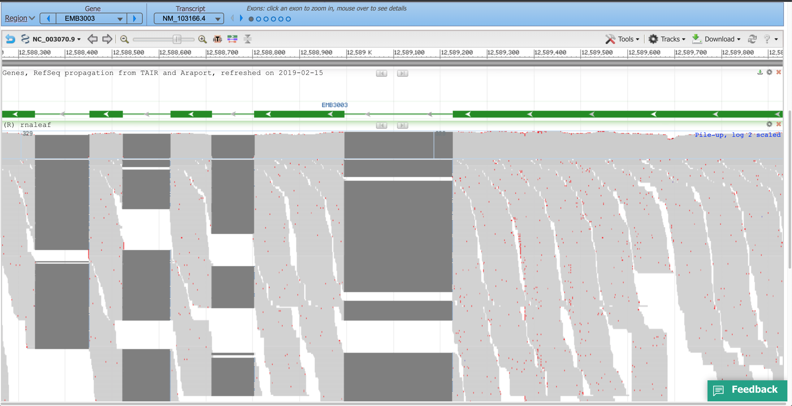
Suggestion: Open latest human genome and visit MEOX1. Load RNA-Seq reads from heart to observe slop row behavior.