Details
-
Type:
Task
-
Status: Closed (View Workflow)
-
Priority:
 Trivial
-
Resolution: Done
-
Affects Version/s: None
-
Fix Version/s: None
-
Labels:None
-
Story Points:2
-
Epic Link:
-
Sprint:Spring 6, Spring 7
Description
In Kelsey's March presentation, she showed a new way to display Venn Diagrams, that a re similar to UpSetR plots but are circular.
I inquired how these were made and she shared the tool as seen in the email below.
It would be worth trying this out and possibly adding it to our toolset repertoire.
GOAL: To test this tool out on some tomato data.
Hi Rob,
Absolutely! I am happy to share. I used the SuperExactTest package in R to calculate the p-values of the overlapping DEGs among cultivars. This tutorial was very helpful to use and essentially "plug in" my data. The "total" number of genes I used was 34,075, based on the number of genes in SL4.0.
Feel free to let me know if you would like to see my code or if you have any thoughts or questions!
Best,
Kelsey
Attachments
Activity
Asking for a code example from Chinaza. Will share it here once I get it.

I gave this task to the Grad student Chinaza (He will be joining Liz's lab in May) to try out and he got it to work.
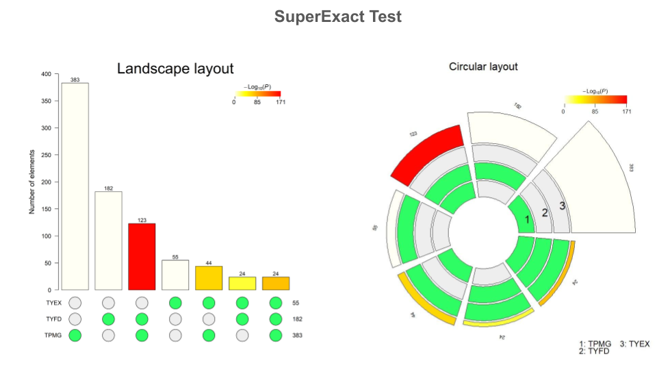
I think it looks cool but one can argue that the circular plot is a bit hard to read when compared to an UpsetR plot.
And on the left side where you have a plot similar to UpsetR, it is misleading. The height of a bar is a summed value, different than how upsetR presents the data.
(Poor explanation I know!)
Given that this tool is simply a different way to view a Venn Diagram or UpsetR Plot, it is best to just use UpsetR plots instead.
Case Closed!!!