Uploaded image for project: 'IGB'
  1. IGB
  2. IGBF-2723

Improve right-side whitespace for app store pages

    Details

    • Type: Task
    • Status: Closed (View Workflow)
    • Priority: Major
    • Resolution: Done
    • Affects Version/s: None
    • Fix Version/s: None
    • Labels:
      None

      Description

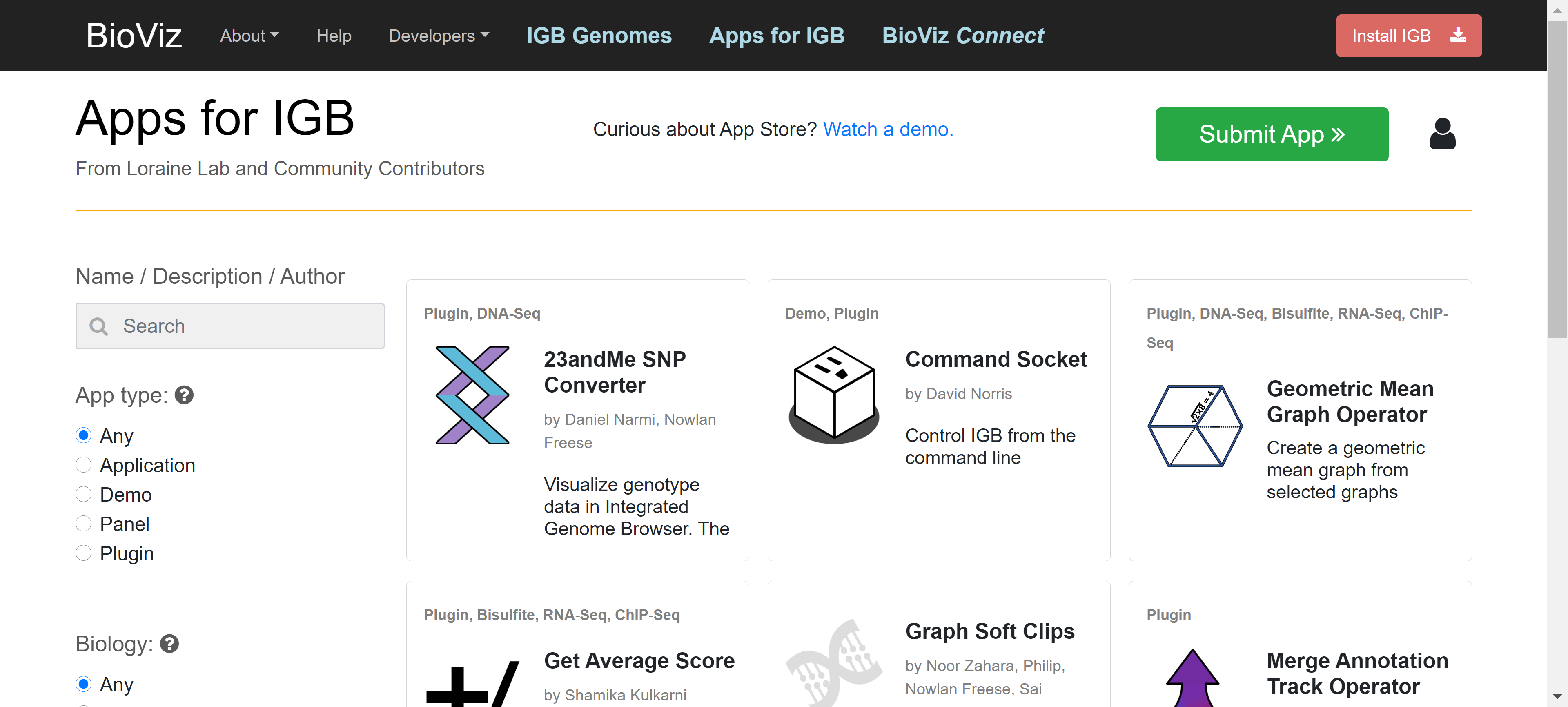
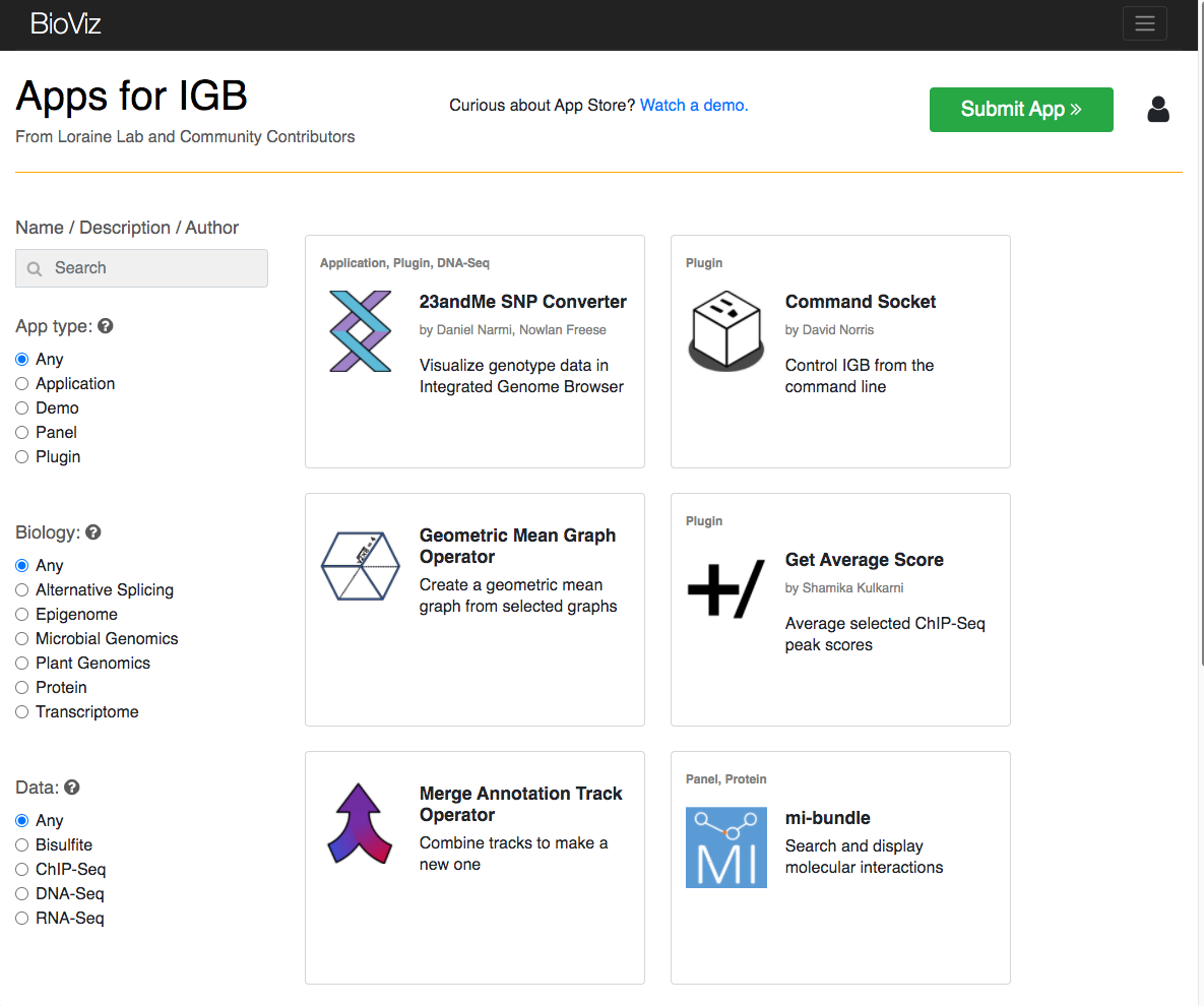
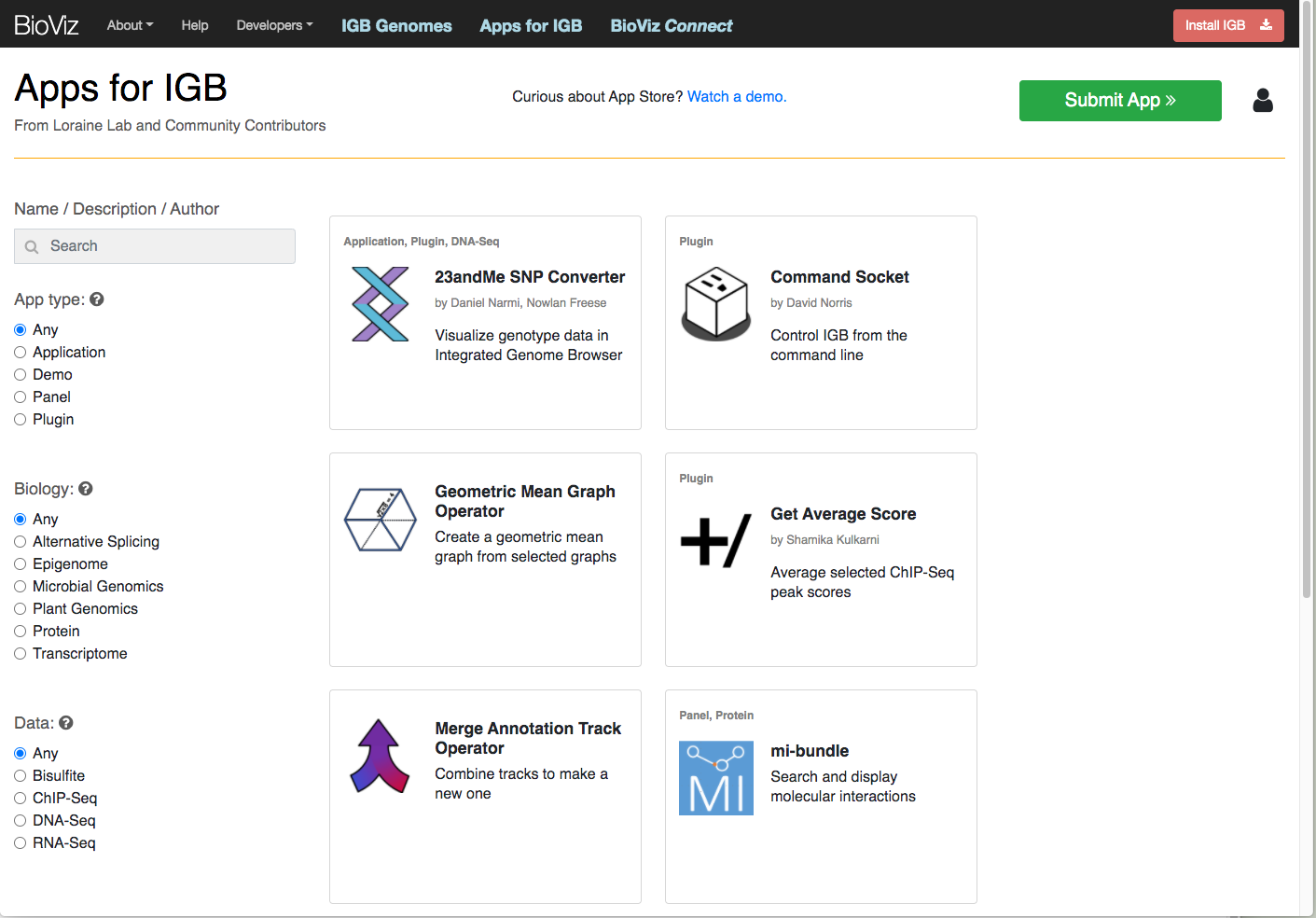
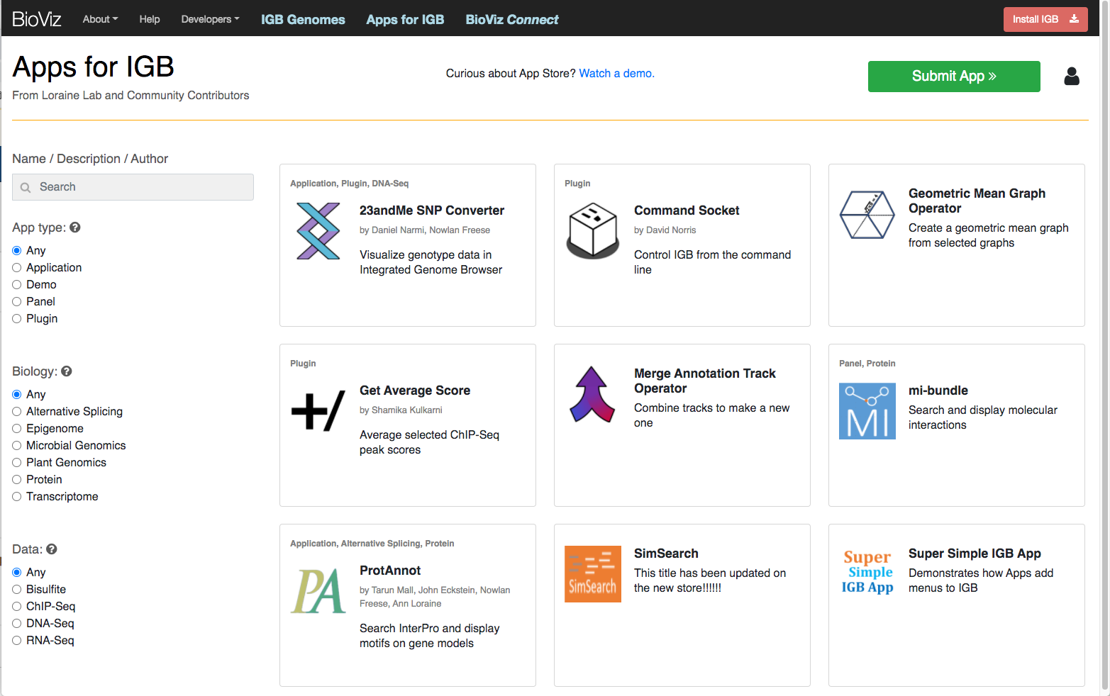
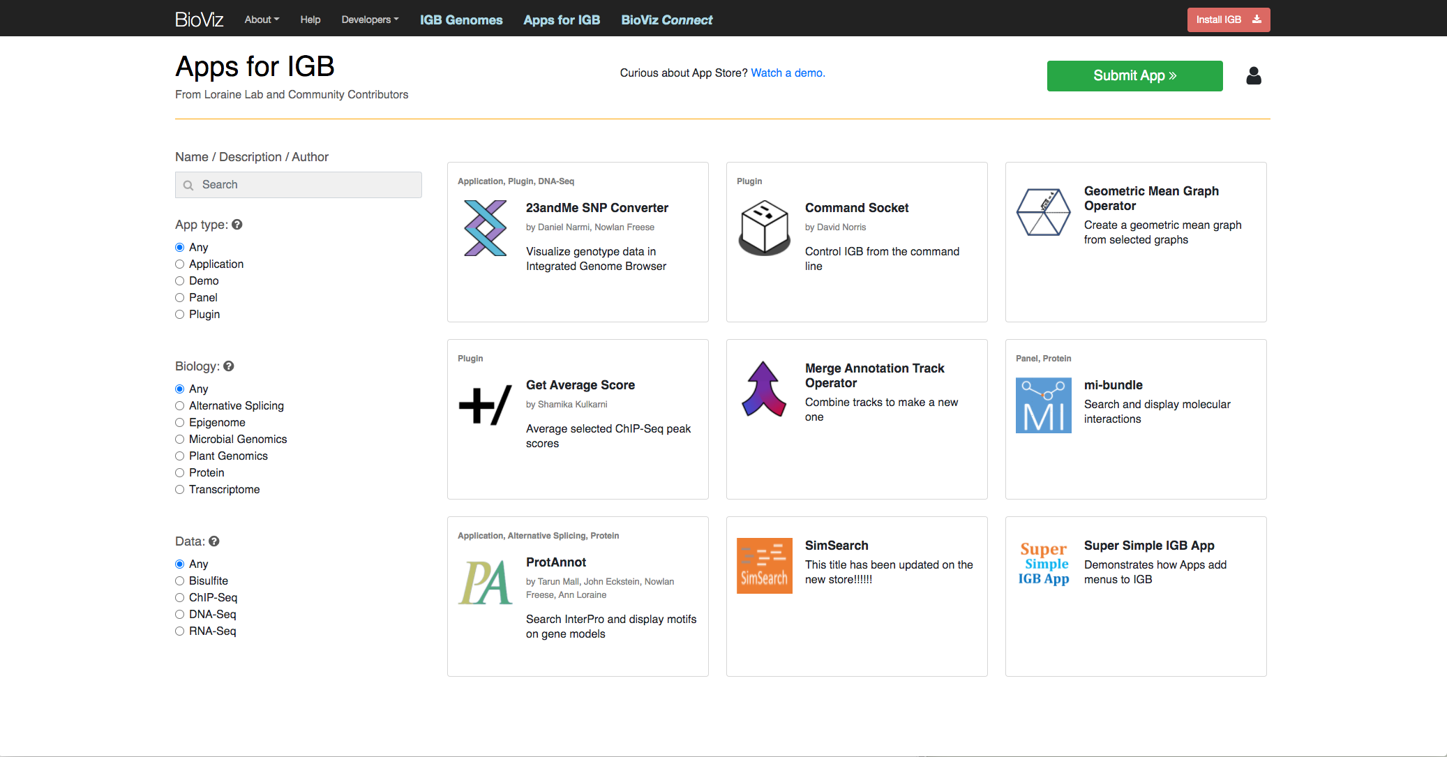
      The content of app store pages is very close to the edge of the page, which creates a cramped feeling. It would be better if some extra whitespace could be shown, about 0.75 the width of the "Name / Description / Author" text string above the navigation radio buttons on the left side of the home page. This same whitespace should persist throughout the site.

      See attached images showing the App Store home page at various widths. The image names include the width (in pixels) for the home page. Notice how the left side radio button panel is always very close to the left side of the window. The other pages also have almost no whitespace between the left side of the content and the window frame.

        Attachments

        1. screenshot-1.png
          532 kB
          Chirag Chandrahas Shetty
        2. width-1184pixels.png
          209 kB
          Ann Loraine
        3. width-1410pixels.png
          227 kB
          Ann Loraine
        4. width-1563pixels.png
          286 kB
          Ann Loraine
        5. width-2072pixels.png
          302 kB
          Ann Loraine

          Issue Links

            Activity

            Hide
            sameer Sameer Shanbhag (Inactive) added a comment -

            Hi Professor,

            I have Submitted the Pull Request for this ticket:

            P.s. [~aloraine]

            Show
            sameer Sameer Shanbhag (Inactive) added a comment - Hi Professor, I have Submitted the Pull Request for this ticket: https://bitbucket.org/lorainelab/appstore/pull-requests/260/igbf-2723-improve-spacing-of-tiles-from P.s. [~aloraine]
            Hide
            ann.loraine Ann Loraine added a comment -

            Merged - thank you! About to deploy.

            Show
            ann.loraine Ann Loraine added a comment - Merged - thank you! About to deploy.
            Hide
            chirag24 Chirag Chandrahas Shetty (Inactive) added a comment - - edited

            [~aloraine] Looks good on 1280px screen and below that. Needs testing for screen size above that. Please refer the image below

            Show
            chirag24 Chirag Chandrahas Shetty (Inactive) added a comment - - edited [~aloraine] Looks good on 1280px screen and below that. Needs testing for screen size above that. Please refer the image below
            Hide
            ann.loraine Ann Loraine added a comment -

            Ok - I will try it on larger screen.

            Show
            ann.loraine Ann Loraine added a comment - Ok - I will try it on larger screen.
            Hide
            ann.loraine Ann Loraine added a comment -

            It looks fine. Moving to closed.

            Show
            ann.loraine Ann Loraine added a comment - It looks fine. Moving to closed.

              People

              • Assignee:
                sameer Sameer Shanbhag (Inactive)
                Reporter:
                ann.loraine Ann Loraine
              • Votes:
                0 Vote for this issue
                Watchers:
                3 Start watching this issue

                Dates

                • Created:
                  Updated:
                  Resolved: