Details
-
Type:
Task
-
Status: Closed (View Workflow)
-
Priority:
 Major
Major
-
Resolution: Done
-
Affects Version/s: None
-
Fix Version/s: None
-
Labels:None
-
Story Points:0.5
-
Epic Link:
-
Sprint:Spring 2 2022 Jan 18 - Jan 28
Description
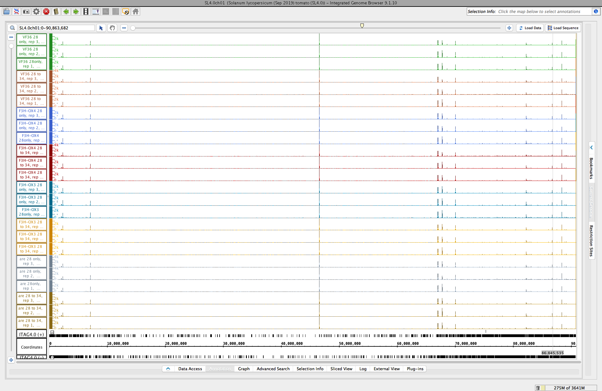
University of Arizona researcher Dr. Cedar Warman is comparing data collected from two different library synthesis processes in which samples prepared by the U. of Az lab were compared to libraries made by a company - GeneWiz, combined, and then sequenced in a single lane.
To analyze results, he has created genome coverage graphs using bamCoverage (deepTools).
For this task, we will set up an on-line call to show relevant features in IGB, mainly graph manipulation methods, that could help him analyze his data. During the zoom call, we will try to highlight ways that visualization can expose interesting features in data and even suggest better ways to analyze the data.
Note that there are a million and one ways to perform statistical analysis of data, i.e., there are many models that can be used. Selecting the right model for one's own data requires data exploration, to gain understanding of one's data and to notice salient properties. For genomic data, one of the most effective strategies for noticing salient features is to interactively view and explore the data in a genome browser such as IGB.
Attachments
Issue Links
- relates to
-
-
- Closed
-
Activity
Something interesting that came up as we were looking at the data: See the attached image file named "scaledcoveragegraphs-ARE-chr1-HS2-2.png".
We noticed that two heat-responsive genes showed different relative amounts of expression increase in the treatment samples, and that the relative difference was the same by replicate. The attached image "scaledcoveragegraphs-ARE-chr1-HS2-2.png" shows one of these. We noticed that expression in rep 3 was higher than in rep2 which was higher than in rep1, across all treatment samples, regardless of genotype. However, no such sample-related relative differences were observed for the neighboring genes, suggesting perhaps that the level of heat experienced by the sample was different. Perhaps more interesting is the fact that the level of expression appears to be calibrated in some way to the treatment. That is, higher temperatures would evoke greater change in expression than lower temperatures, and that this "level of expression" variable is continuous and possibly even predictive of the amount of heat actually experienced in the biological material.
This observation for only two heat-shock related genes suggested a larger data analysis experiment, in which we would examine variability rather than difference of expression as a way to detect heat related effects. This anecdote illustrates how visualization can inform the course of data analysis for a project.
I can access this and can make comments! We definitely should use JIRA for more of the tomato related tasks!
Moving to Done.
On Jan 25, 2021, I organized a meeting with members of the Muday lab to explain how they can look at coverage graphs in IGB.
Some problems arose for people using Windows to look at the data:
- One person had difficulty figuring out how to use click the checkboxes in the Data Access panel. This is because the checkboxes look really weird and it's nearly impossible to see that they are something that can be checked.
- The same person also was confused about the existing folders after adding the new data source. It was not obvious that there was a connection between the folder name that appeared in the Available Data section and the name given to the new folder in the add Quickload dialog.
- Another person got confused about the Web browser view of the data versus the IGB view of the data.
I asked for the opportunity to present at noon on Thursday Jan 20. I originally asked for a half hour, but the session ended up lasting about 1.5 hours.
We did the session using Cedar's zoom room. I shared my screen. I started by showing some Unix features for connecting to private networks using ssh tunnels (-J option) and how I used aliases to move around a system.
Then we moved on to the IGB presentation/demonstration.
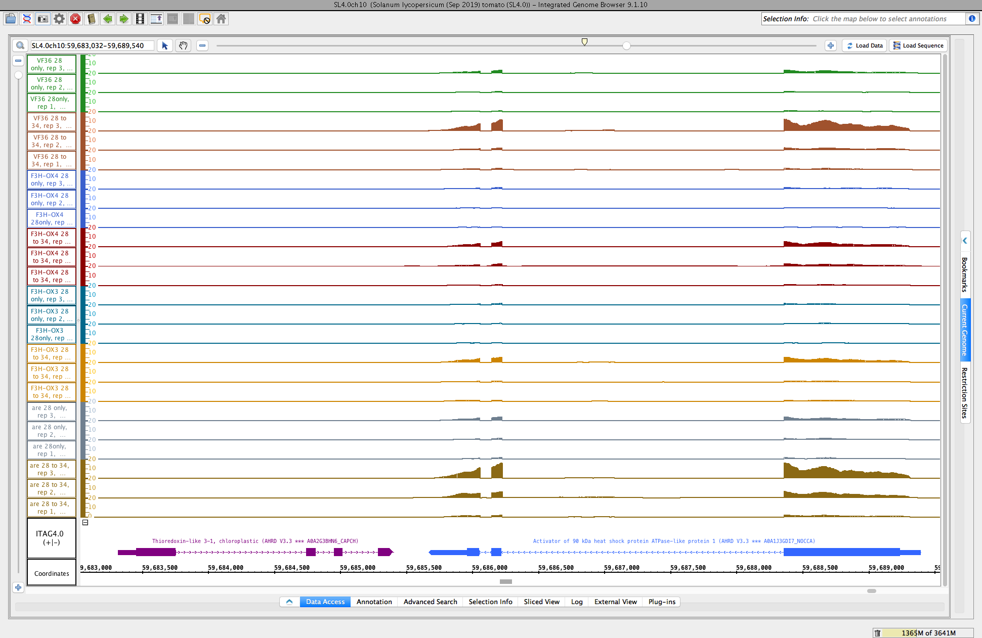
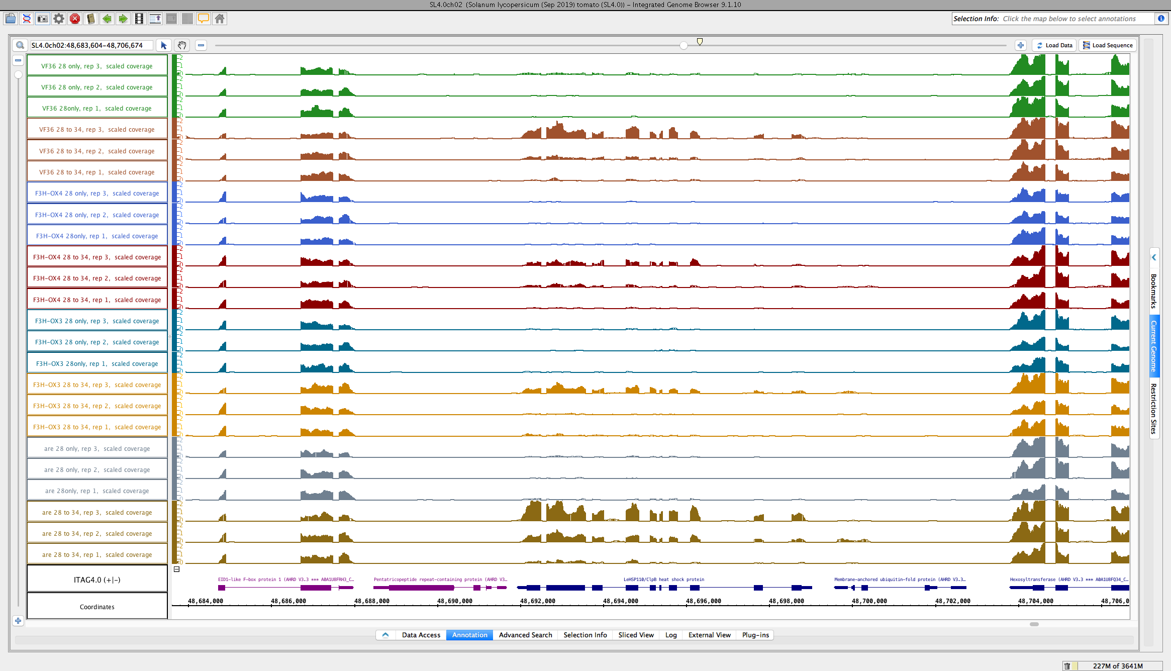
For demonstration, we focused on looking at newly deployed data from the ARE temperature shift experiment from the Muday lab.
Showed the following aspects:
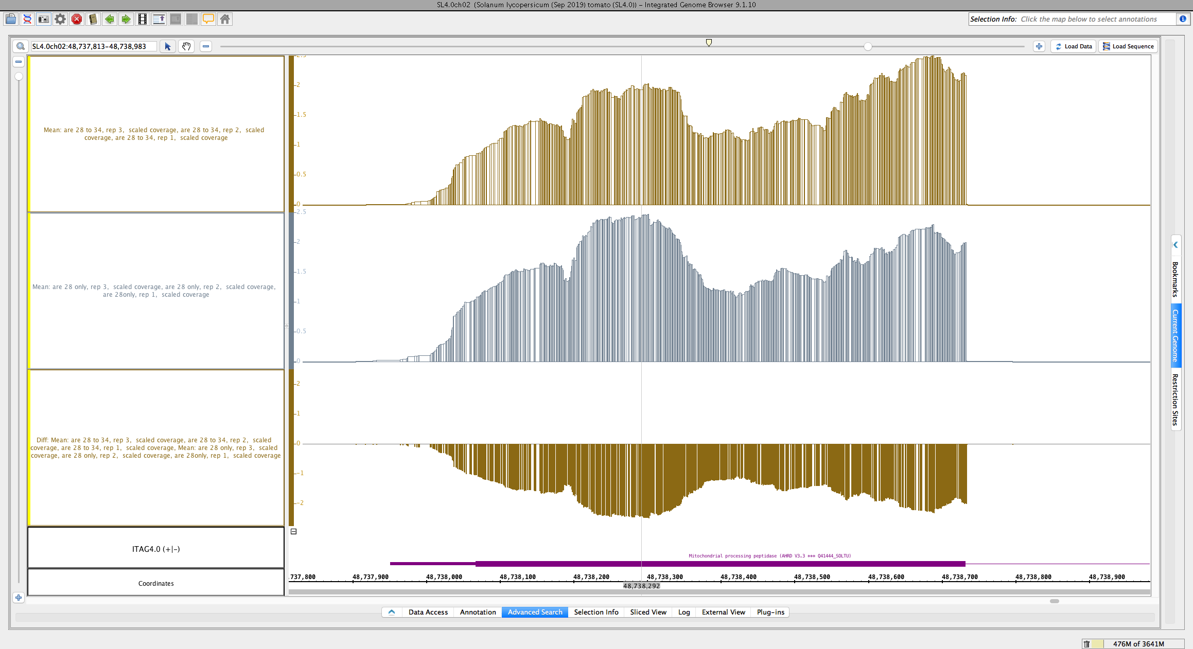
As a demonstration, made mean graphs of two sets of three replicates each. Then made a difference graph of the two averages. However, we noticed a problem with the difference. I showed how to view the y axis value for a graph, and we did this to check that the difference was indeed the y-axis value from one graph subtracted from the y-axes value of the other graph. However, the difference appeared to be wrong! See attached image named "scaledcoveragegraphs-ARE-chr1-diff-problem.png" for reference. This appears to be a bug we need to fix.